I’m not gonna lie. Simultaneously choosing a bunch of finishes – like paint colors for walls and ceilings and trim and doors, cabinets for two kitchens, and tile for six bathrooms (plus two mudroom/laundry rooms along with two kitchen backsplashes) has felt overwhelming at times. Heck, planning just one room, like a bathroom renovation on its own, can feel overwhelming… and here we are planning six different bathrooms, two different kitchens, and 10 other rooms simultaneously! But we’ve managed to keep our heads on straight (so far) and even have some advice to offer through it all.
So whether you’re working on a new construction and have to make a lot of decisions like this all at once, or just trying to systematically renovate your home while keeping each room in mind so it all ends up feeling cohesive without being boring or too repetitive, this post is for you. We actually talked a little bit in this week’s podcast about how we chose each side of the duplex’s (not white!) kitchen cabinets and tile, but we knew that collectively showing you a bunch of our selections all in one post – and breaking down our process for picking them – might help other people out there who have burning questions like these ringing in their ears:
- “Is this tile/paint color/cabinetry the right choice?”
- “Am I going to regret this?!”
- “How is this all going to look together?”
- “Am I being too safe and boring? Too out there and crazy?”
- “I keep going round and round – how can I actually make a decision?!”
Basically, this is the stage where you’re past all of your inspiration gathering and general planning (we shared our duplex style planning with you here) and you’re trying to take those images you saw on Pinterest or in a magazine (or just that dream room that lives in your head) and make it a real room in your real home. How do you do that? You have to find actual products that you can buy and paint colors that will tie it all together (and did I mention there’s a budget that you have to work with too)?

So here’s what we do to keep things feeling organized and to help focus ourselves and visualize things a lot better – you know so it feels less like throwing darts at a board while blindfolded – and more like following a streamlined process of steps to narrow things down and picture them before you make any final decisions.
First, Make A List
Before you start attempting to making finish selections, you need to know what decisions need to be made. And what helps us to to keep things feel more manageable is to arrange that in the order that each selection needs to be made (with the most urgent ones up top). For example, with so many decisions ahead of us – rugs, furniture, art, bedding, the list goes on and on – we’ve chosen to focus on just the most urgent things that we need to select before any of that: paint, tile, cabinetry, plumbing, and lighting. These are the things that will go into each of the duplex’s freshly drywalled rooms to make them feel like actual rooms instead of white boxes (if you haven’t seen the most recent video tour, watch that and then come back to this post since it’ll make a lot more sense).
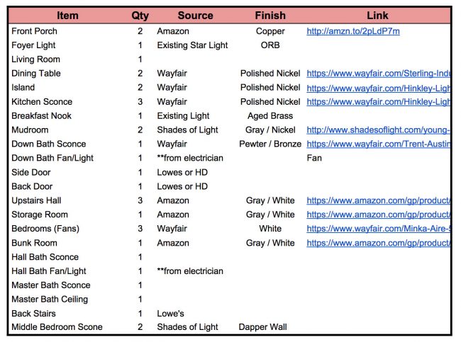
However you make and organize your list is up to you. For us, what starts off as a paper list often ends up as a spreadsheet once we start ordering. Here’s an example of one we used when ordered lighting for the pink house. Those first two columns (item & quantity) are the list we’re talking about. We took inventory of exactly what each space was wired for (did we need a pendant? a can light? a wall sconce? a chandelier? a fan?). It usually helps to walk through your space in person or look at a floor plan (or both!) to make sure you’re not missing anything.
The chart above is incomplete because at some point we typically move over to a more visual list, like a mood board, so we can better see how everything is coming together. Here’s one we’re in the process of making for the duplex, but more on that – and the actual items in it – in a minute.
Then, Pick Your Star(s)
We learned long ago that a room where too many things scream for your attention can get chaotic. Plus, choosing which pieces will be the focal point relieves the pressure to make every single item in a room “interesting” which can be a tiresome, budget busting, and sometimes impossible goal. So we often break design choices loosely into two categories: stars and supporting players. The stars are the items you want people to notice when they first walk in – like the bold wallpaper, colorful rug, large chandelier, or dramatic paint on the walls.
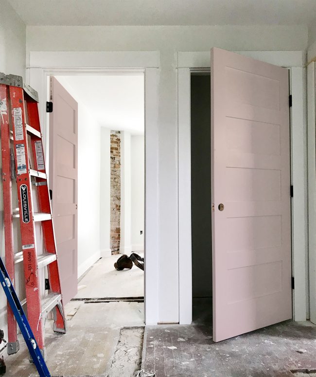
Some rooms have only one star, others may have several – that’s up to you. But pretty much everything else functions to support those items – like the neutral couch that falls into the background or the white wall that helps your starring artwork or chandelier stand out. For example, readers of our email newsletter know that we’ve been hung up on the idea of colorful doors in the duplex. In fact, we’re using one of the exact colors we saw in this showhouse that we worked on earlier this year (Sherwin William’s Oyster Bay), which is pictured below, for all of the interior doors on one side of the duplex.
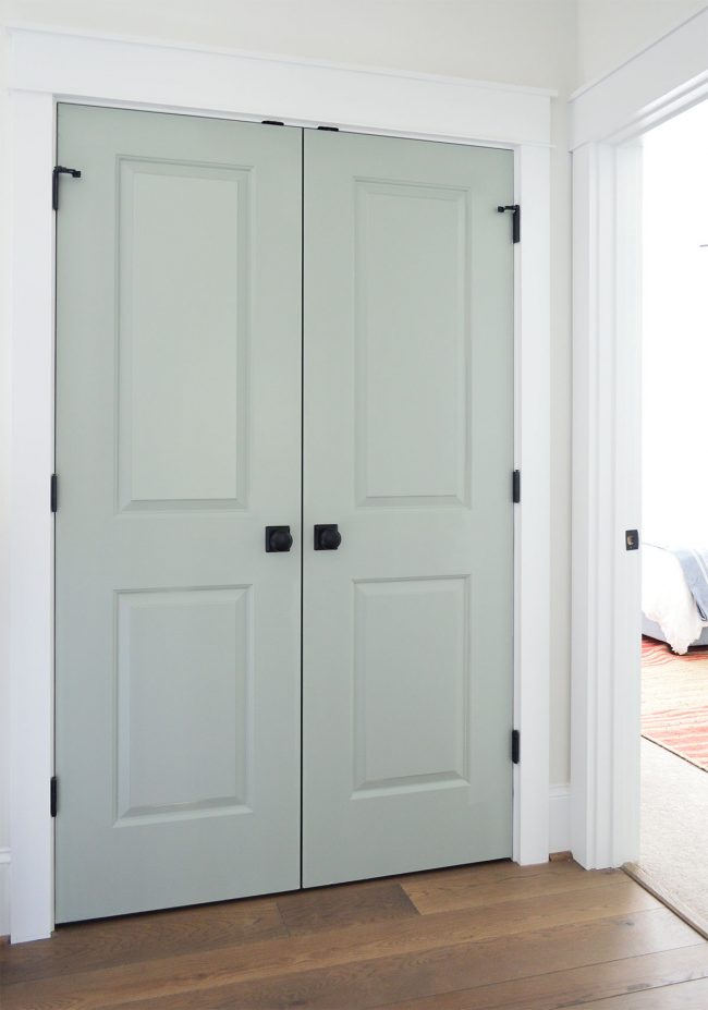
We knew if the doors were going to be “stars” then the wall paint around them probably shouldn’t compete for attention. So all of the walls are going to be a very light warm gray (SW Spare White). The interior doors, all of which are solid wood five-paneled doors, are actually going up in the duplex this week and we snapped some in-progress photos over the weekend. They haven’t been painted yet, but I photoshopped the image below to give you an idea of what the other side of the duplex might look like. For that side we picked a muted pink tone (SW White Truffle) which should pair nicely against the same very light warm gray walls on that side (they’ll also be SW Spare White).
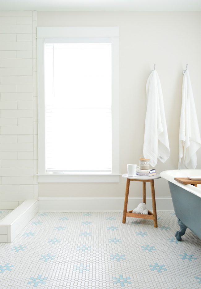
We also picked our stars for the bathrooms to help focus our tile shopping. We learned from doing the pink house that we prefer a fun tile floor versus a fun tile shower wall in a bathroom (we can enjoy our cool patterned hex tile floor in the master bath from any vantage point nearby, but the pretty accent tile that we used on the back wall of the hall bathroom’s shower is often hidden by the bathroom door swinging in front of it and the shower curtain itself. Choosing to focus on some playful and beachy floor tile greatly simplified the process of tile shopping because we could focus our efforts on finding interesting things for just that area, knowing that almost anything would work with some incarnation of white subway-esque tile on the walls of the shower.
Next, Give Yourself Limiting Parameters
Having a million ideas and possibilities is exciting at the start of a design project, but at some point you have to face reality and actually order something. So I know limits don’t sound fun, but they ARE YOUR FRIEND at this stage. Some parameters may be out of your control – like your budget, which clearly puts a cap on your tile’s price per square foot. Or your contractor’s requirement that you order lights from certain vendors or something like that. Plus, you may already know that you want only a certain color, or finish, or size.
Whatever parameters you’ve established, it’s helpful to use those to filter results when you’re searching online. Sites like Home Depot, Lowe’s, and Wayfair are becoming better and better about their search filters. USE THEM. This will save you time and keep you from going crazy.
One parameter we set for ourselves when shopping for floor tile was “no super small tiles like the patterned hex we laid in the master bathroom at the beach house.” As much as we love how that floor turned out – it was very, very, VERY time consuming to install compared to the other spaces where we used larger tiles.
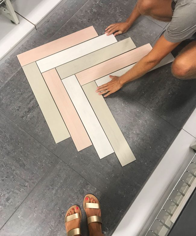
Choosing larger tiles with interesting patterns instead of relying on smaller tiles isn’t a parameter that makes sense for everyone or every tile project – but it really helped our decision-making process when we imposed that limit on ourselves. And the good news is that we were still able to have some fun within that guideline. For instance, we discovered that The Tile Shop sells these long 4″ x 24″ porcelain tile planks in several hues (their display shows all one color being used together) but we realized it would be fun to use all three tones together. So we bought an equal amount of pink, white, and taupe tiles to create our own large-scale herringbone for one of the mudroom floors. This was us mocking it up on the store’s floor:
We also wanted extremely durable tile materials – porcelain and ceramic only. They’re both hardworking non-porous surfaces that are typically much easier to maintain than marble and cement tile (both of which are porous, so they can get stained and you need to worry more about sealing them, etc). So that material parameter immediately cut out a ton of higher maintenance (and higher budget) choices for us. So again, it really helped us focus on the best options for this project.
Lastly, Visualize Before You Finalize
By this point we often still have 10 million tabs open in our web browser with potential options. So after a couple of passes of nixing things we don’t feel strongly about, we usually find it helpful to visualize all of the pieces together. Believe me, you can go round and round liking 20 things and not knowing how they’ll fit together or how you’ll narrow it down for hours, clicking from browser screen to browser screen – and then you finally visually group them so you can see things together AND IT MAKES THE DECISION 100% EASIER!
The actual way that you choose to visualize them will vary – it may be a mood board of some sort (we use Photoshop) or you can just pin everything to a Pinterest folder to see them all together as a group. Heck, you can even print things out to make a collage and swap things in and out to see what combos you like most. However you approach it, just the exercise of viewing your top contenders together, and moving one thing in and pulling another thing out will help you see what works well together.
For instance, while we were sifting through tile options we kept a Photoshop file like this open – and we kept dragging different contenders in and out (this isn’t the final version below, btw – it’s what it looked like in the middle of the process). It was a quick way to evaluate what looked good together and what didn’t – and much easier than clicking from tab to tab in our browser, which can make your head spin and leave you feeling like you might never make a decision.
*Note: most of these tile choices will be linked for you later in the post*
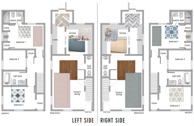
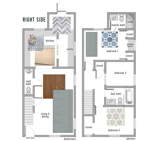
As we got clearer and clearer on what we liked together, we moved on to creating the floor plan images that you saw earlier, where we just dragged selections into actual rooms on each side of the duplex. Not only can we see everything in one place, but we can also stay organized as to what is going where.
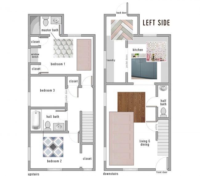
With two identical-but-mirrored floor plans, sometimes it’s hard to keep things straight, so this definitely helps us stay on top of where each tile or cabinet color (or door color) will go. Plus we have the added benefit of getting to see how everything will look all together on each side of the house.
So now that we’ve shared a little bit about our process for selecting items, we’ll tell you about the items we chose themselves!
Duplex Tile, Cabinetry, & Paint
We didn’t set out to create a “pink side” and a “blue side” but once we chose the two interior door colors, it started to naturally lean that way. But we still plan to inject both colors – along with mint and various neutrals and wood tones – throughout each side as we furnish and decorate. So, in the end, it won’t feel as monochromatic as this mood board suggests.
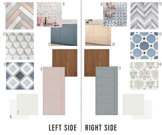
Here are the product links for you guys, as promised:
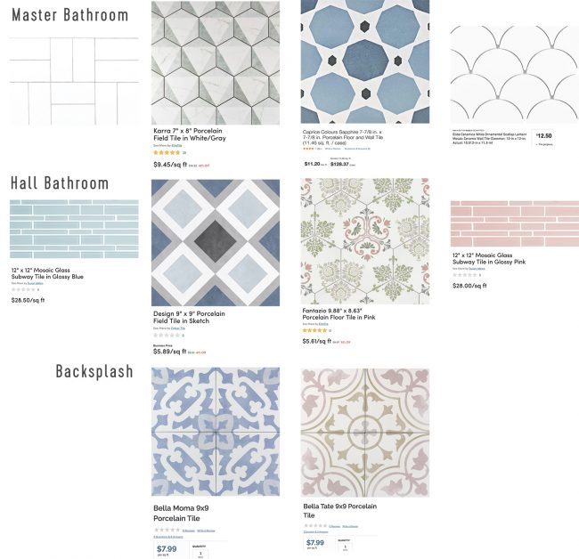
- Mudroom floor in pink, white, and taupe
- Master bathroom floor
- Hall bathroom floor
- Kitchen backsplash
- Kitchen lower cabinets: Ikea Kallarp
- Interior doors: SW White Truffle in semi-gloss
- Interior walls: SW Spare White in eggshell (both sides)
- Interior trim: SW Extra White in semi-gloss (both sides)
- Kitchen backsplash
- Kitchen lower cabinets: Ikea Askersund
- Interior doors: SW Oyster Bay in semi-gloss
- Mudroom floor
- Master bathroom floor
- Hall bathroom floor
The wood tone on both sides is just to represent the wood floors, which are oak hardwoods that we plan to sand down and stain with Minwax Provincial (the same stain we used for our own floors in Richmond).
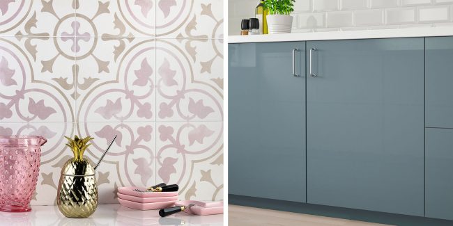
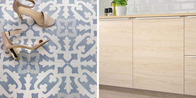
You can hear more about how we chose the kitchen cabinetry in this week’s podcast, but we knew we wanted to do non-white cabinets on the lowers to keep things a little more unexpected and playful (if you can’t take a few fun risks at a beach house where people will only stay for a week, where can you?!). To stick to our tight kitchen budget, which is around 4-5K for each fully finished kitchen (including appliances), we wanted to work with the stock options at Ikea since we have been really happy with their cabinetry at the pink house. And we were psyched to find both a wood toned cabinet and a painted cabinet option that we loved. In one duplex kitchen we’re pairing this pink tile with these gray-turquoise flat front cabinets. We will probably do a few white uppers on each side too – maybe with some open shelving.
On the other side of the duplex in the other kitchen, instead of colorful cabinets, we’re pairing these beachy wood flat front cabinets with a similar tile, but in a blue colorway. We bought both tile choices from The Tile Bar and they look like cement tile, but they’re porcelain! Three cheers for easier maintenance and added durability.
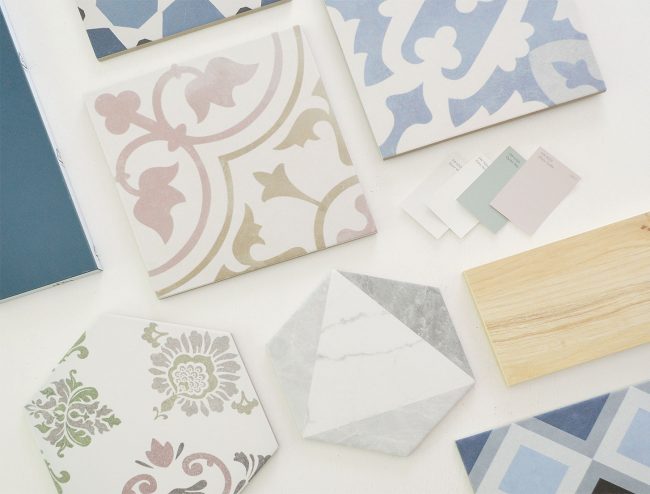
Here’s a look at some of the other tiles that we purchased. Three of these are from Wayfair (top right, bottom right, and bottom left), since we had such good luck ordering tile from them for the pink house, and the one in the top left is from Home Depot. Both Home Depot and Lowe’s seem to be upping their tile game lately, so it was fun to find an option like this there! And all of this tile is porcelain – again: super durable – and it’s all specifically made for floors, since we don’t want to get anything too slick that’s not meant for that surface.

I know it all looks a little chaotic put together like that, but keep in mind that these are all going in separate rooms with a lot of “supporting players” – like white subway tile, very light gray walls, fluffy white towels, white vanities, and wood/neutral touches. So in the end they should add some fun and interest to each bathroom, but not be too overwhelming since they’re all going to be tempered by everything else in the room. Here’s hoping, anyway!
P.S. If you missed last week’s duplex video tour, go watch that because Sherry talks about a lot of plans we haven’t covered here – like the window we’re adding to each of the hall bathrooms – and the shelves we’re adding to each side of the master bedroom in front of the exposed brick chimneys. And just for comparison’s sake, you can check out how the pink house turned out. It feels a little more old/historic since there was more original stuff that we could save in that house. Sherry keeps saying that she thinks the duplex will feel like its playful younger sister with a beachier and slightly more colorful wardrobe.
*This post contains affiliate links*
The post Our Duplex Paint, Cabinetry, & Tile Choices (Let’s Just Say They’re Not “Safe”) appeared first on Young House Love.
Our Duplex Paint, Cabinetry, & Tile Choices (Let’s Just Say They’re Not “Safe”) published first on www.younghouselove.com
No comments:
Post a Comment