As much as we love to simplify and declutter, we’re not aiming for that ultra sleek and sometimes sterile look that’s often associated with minimalism. So we’ve been trying out a step-by-step process for creating a minimalist space that still feels warm, cozy, and inviting. Spoiler alert: Sherry loves the easy formula and is basically going nuts on the whole house. We’re also starting to bring our vision for the duplex kitchens to life and – curveball alert! – we’re steering clear of white cabinetry. You can hear why we don’t think it’s right for the duplex, along with learning how we’re getting a custom look on a serious budget. Sherry also ups her underwear game and John conquers one of life’s little daily annoyances.
You can download this episode from Apple Podcasts, Google Podcasts, Stitcher, TuneIn Radio, and Spotify – or listen to it below! Then use this page to check out any links, notes, or photos we referenced. Note: If you’re reading in a feed reader, you may have to click through to the post to see the player.
What’s New

- As you may have seen in our duplex style inspiration post, the picture above is one of our biggest inspirations when we envision the duplex kitchens – and after our trip to Ikea last week, we think we’ve found all of the materials to make it happen (on a nice affordable budget).
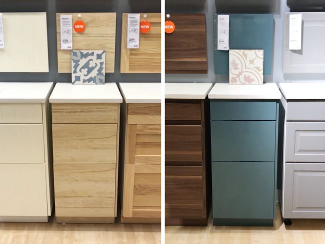
- Below are some photos of us trying to picture things in Ikea (yes, we brought our tile samples with us – and even our paint swatches). On the right you can see the combo that mimics the look from our inspiration photo above using this tile and Ikea’s new Askersund cabinets. On the left is the other combo we’re trying with colorful cabinets (Ikea’s Kallarp in a glossy “gray-turquoise”) and a similar patterned tile in a different colorway.
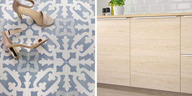
- It’s a little hard to get a sense of tile pattern in those shots above (plus, Ikea’s lighting is blergggg), so these images should give you a better sense of the combos. Here’s the first with the wood cabinets (we won’t use metal pulls like the ones below though) and our blue tile.
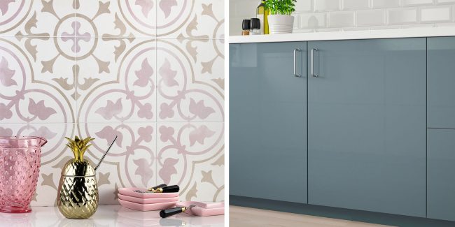
- And here are the glossy blue-gray cabinets with our pink/gray tile for the kitchen on the other side of the duplex.
- We’re working on a post with more info on all of our selections so far for the duplex (including bathroom tile, paint colors, and more) but we’ve mentioned that we’re planning to pair both kitchens with some light counters (most likely granite or quartz) and some combo of open shelves and upper cabinets. We’re thinking we’ll do the upper cabinets white in both spaces as well.
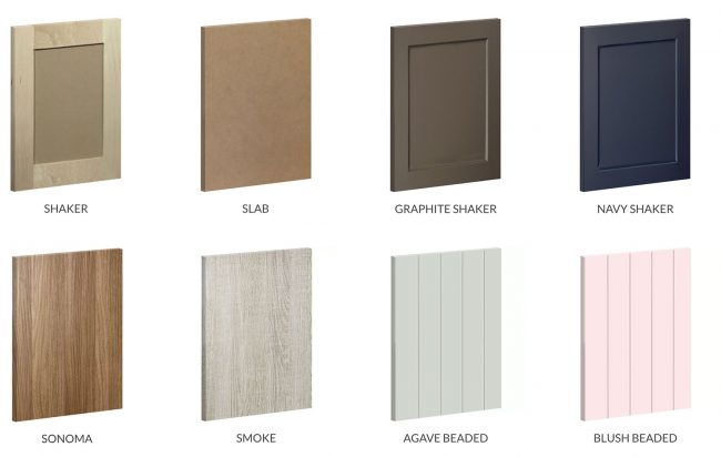
- And if you’re looking for more info about Semihandmade, below you can see some of the styles they carry. We priced out the unfinished ones (the first two below) and they were $400 – $500 more than the Ikea ones shown above (which already come factory finished/sealed). I also looked into the more colorful beaded options, but they were about $1100 more, so we’re still holding out for the right project to try them out. Maybe one of our own home’s bathroom renovations…
- And now the photos you’ve all been waiting for – the before & after of my key ring, thanks to paring down my keys and my membership/loyalty cards (here’s that Key Ring app I used to digitize my infrequently used cards). This is the leather key organizer I bought on Etsy too. It holds up to 6 keys and/or some loyalty cards.
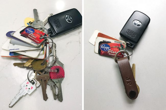
- Also, as a PSA, it’s not recommended that you post pictures of your keys online (someone with enough know-how can duplicate them from a photo). So I’ve digitally altered the tooth pattern on the keys shown here. No one’s copying our kitty key on my watch!
Cozy Minimalism
- There’s a quick peek at some of the spaces Sherry has started simplifying in our house based on the process in Myquillyn Smith’s upcoming book Cozy Minimalist Home. You can pre-order it now, and follow Myquillyn (aka “The Nester”) on her blog The Nesting Place for more info and freebies. You can also hear her on Episode #58 of our podcast where we all talk about how much she shares of her children online.
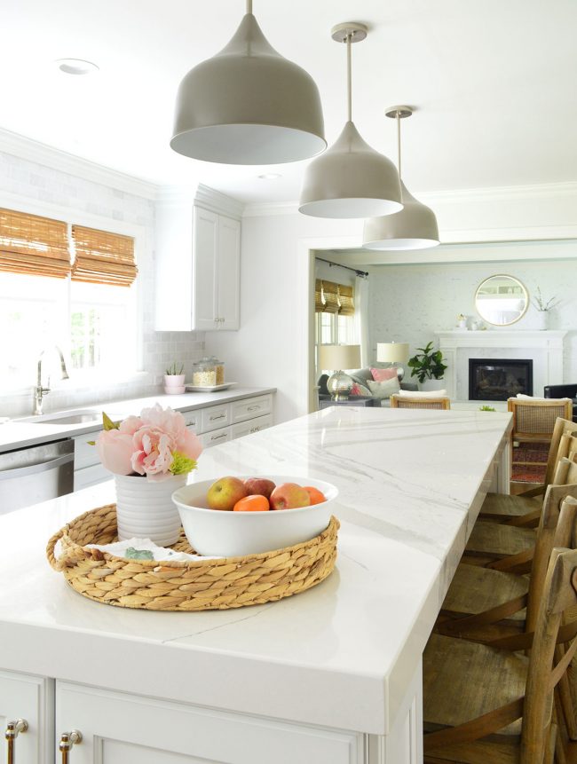
- Here’s a shot of our kitchen island from back when we revealed our kitchen renovation a couple of years ago.
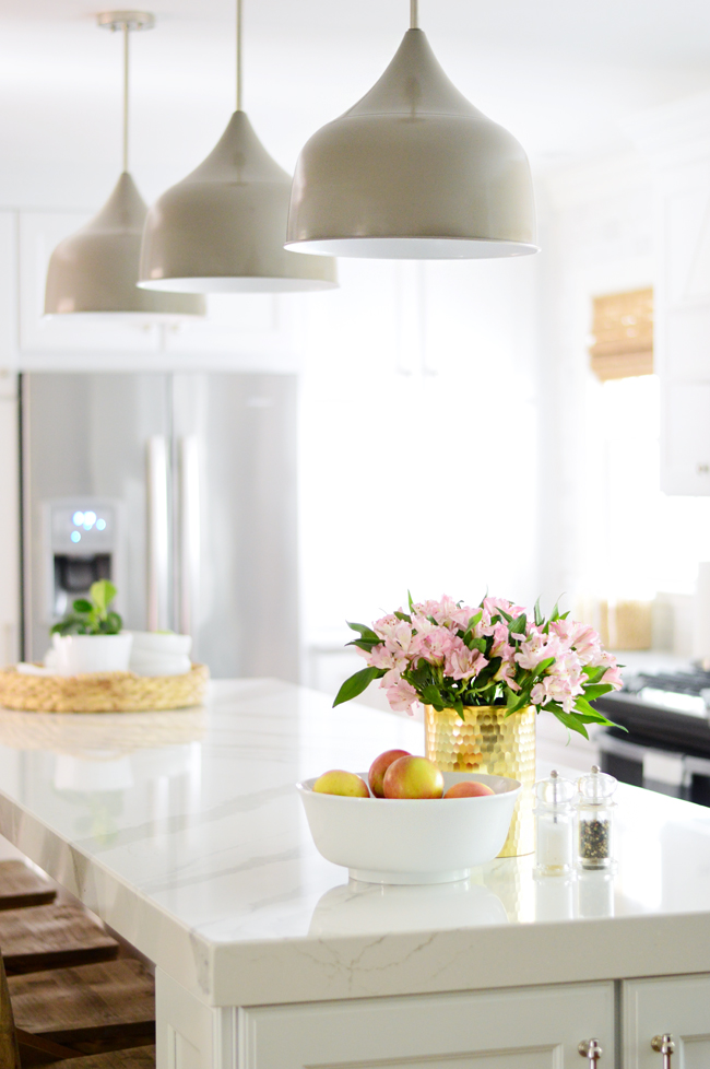
- And here’s that same angle today with the counters looking much more clear. Admittedly it’s a less “pretty” photograph because it lacks those visual anchor points that a typical styled photo has… but in real life, it makes the room feel open and more ready for anything – from spreading out homework to baking cookies.
- Here’s the island from the other angle, which shows that there’s still plenty to look at in this room (it doesn’t feel stark, just less styled and filled up than it did before). We also like how clearing the far end of the island lets your eye see through to the living room more easily (the kids are often in there while we’re in the kitchen, so it’s nice not to have stuff blocking the view anymore).
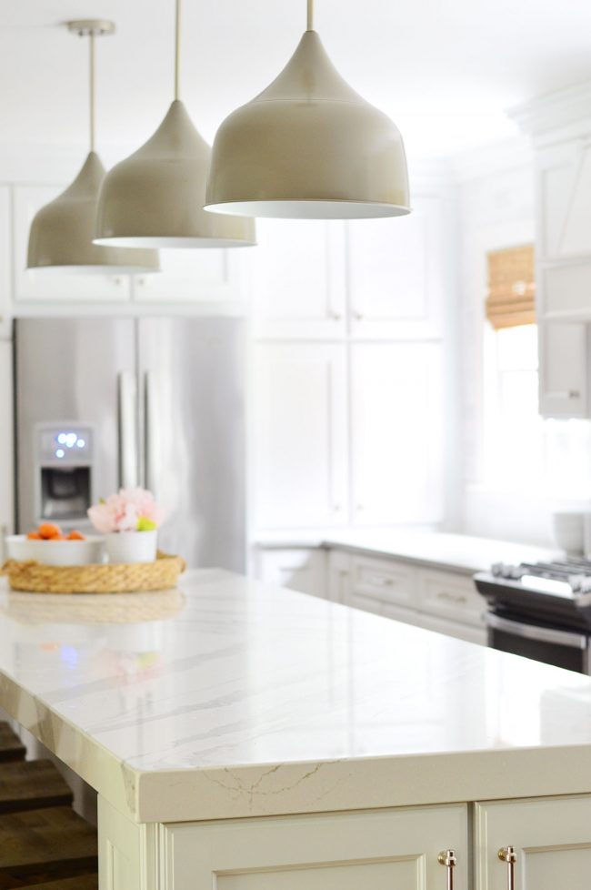
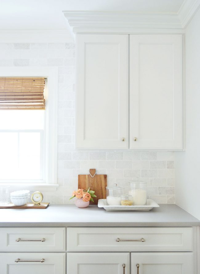
- Here’s another example of how we simplified but it still feels cozy – just less styled and full. Before we had lots of decorative objects on the counter (the cutting board, the flowers, the clock, even the sugar and flour containers that we’ve not actually used sugar or flour from in years).
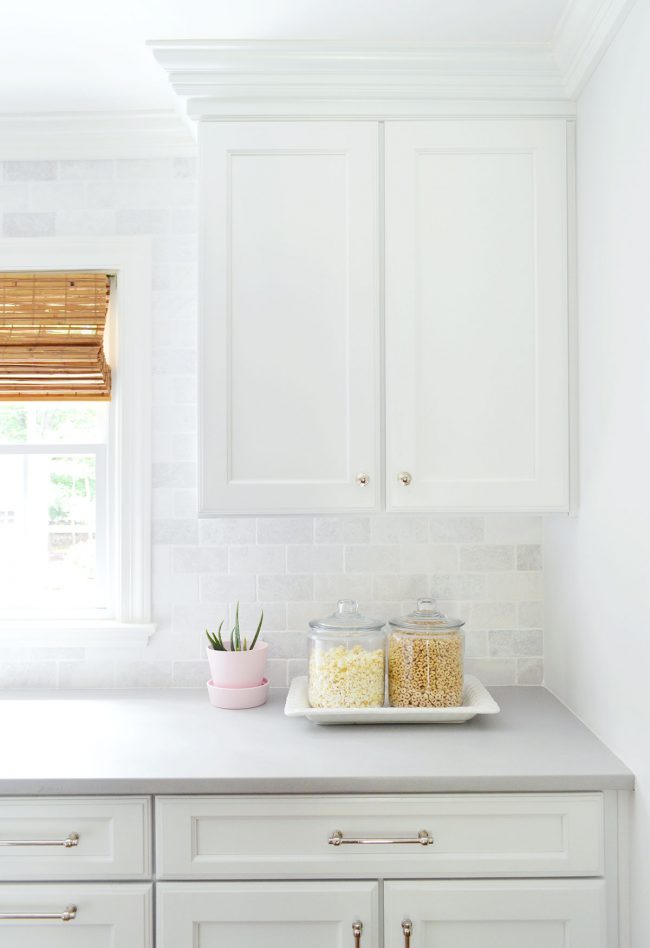
- Here’s the same angle today. There’s still a decorative object (the plant) but we’ve replaced those unused canisters with ones that we actually do use (popcorn & cereal get stolen from them daily). These used to sit on the opposite end of the counter, which felt cluttered whenever we plopped down our grocery bags there to unload them, so now that space is freed up to be used for that without feeling as cramped. The breathing room feels great.
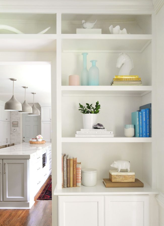
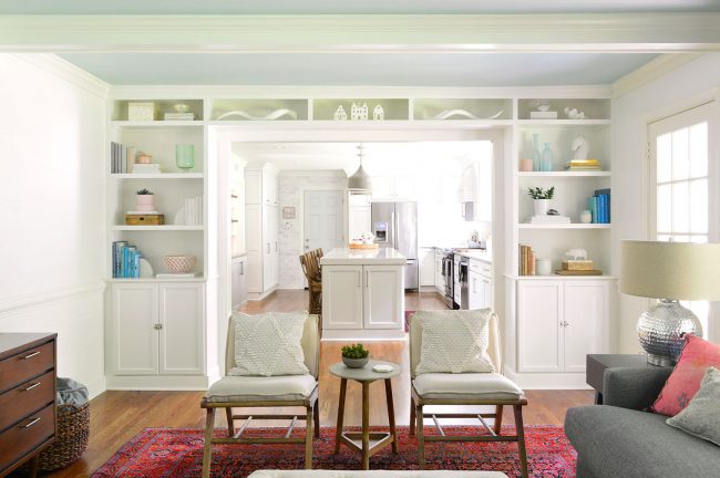
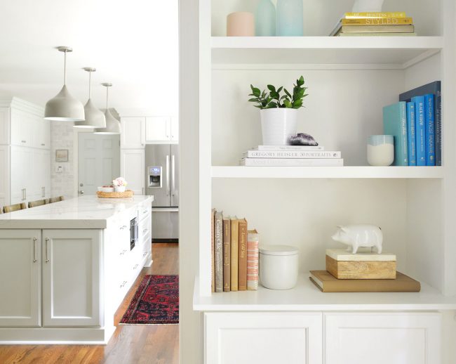
- Moving into the living room, this is what the built-in bookcases looked like after we made them and filled them to the brim with colorful books and objects (learn how we made them here!).
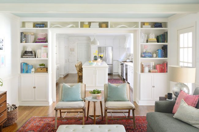
- While we enjoyed that full and colorful look for a few years, we both felt ready to simplify things a little so that wall feels a little less heavy and packed. Here are the bookcases today after we donated the books we were done reading/referencing and generally simplified things. You can see there are also fewer frames on the left wall too.
- You can also hear a longer discussin about the “controversy” of books as decor objects (including the backward book trend) in Episode #85.
- Like the kitchen counter photos, I’d argue that the more minimal looks don’t always register as better/more interesting photographs (it didn’t help that I was taking the new photos during thunderstorms – thank goodness for long exposures!) but in real life it has been a nice change of pace. Just having less “stuff” around has made the house feel lighter and less overfilled.
- And now, we must end this section with the SNL sketch that we referenced. Nuni and Nuni are minimalists, right?
We’re Digging

- Above are the three Third Love bras that Sherry has bought over the last two years and can’t stop talking about – a classic plunge, a strapless bra, and a fancy lacy one. They each come in different colors, but Sherry (unsurprisingly) chose the blackest/darkest option for each one.
- And here’s that Daily Beast article I was so fascinated by: “How An Ex-Cop Rigged McDonald’s Monopoly Game And Stole Millions.” It’s no surprise that it’s been optioned already and will become a Matt Damon/Ben Affleck produced movie!
If you’re looking for something we’ve dug in a past episode, but don’t remember which show notes to click into, here’s a master list of everything we’ve been digging from all of our past episodes. You can also see all the books we’ve recommended on our Book Club page.
And lastly, a big thank you to Universal Furniture for sponsoring this episode. Learn more about their new Spaces collection specially designed for smaller homes at UniversalFurniture.com/YHL.

Thanks for listening, guys!
*This post contains affiliate links*
The post #111: Can Minimalism Be Cozy? appeared first on Young House Love.
#111: Can Minimalism Be Cozy? published first on www.younghouselove.com
No comments:
Post a Comment