Ever since MyPublisher shut down last year, one of the most frequent questions we’ve been getting is “who are you going to use to make your family photo book now??” For months and months, we had no good answer because we only print these annual “family yearbooks” in January, once the previous year has wrapped up (you can see examples of them here). But now that 2018 is here, we’ve officially added our 2017 album to the stack and we are VERY happy with the result.
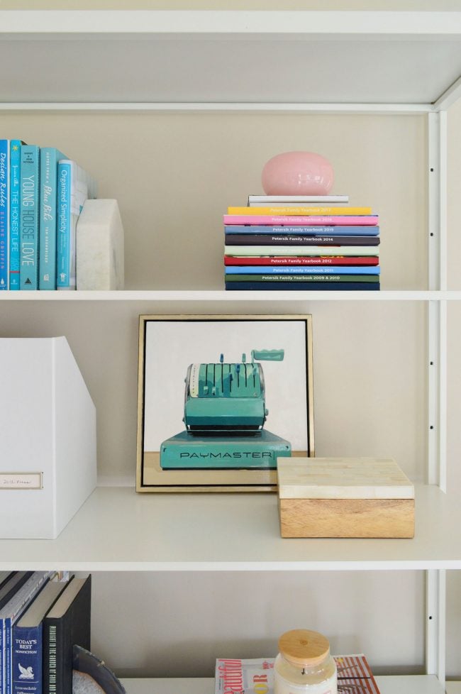
We’re no experts on photo printing services by any means, but after becoming dedicated users of MyPublisher for YEARS (we purchased our first annual album from them back in 2011) we had become pretty accustomed to their service and (more importantly) had built a nice uniform stack as each year passed. And judging by the response from you guys, we weren’t the only ones who were upset to see them close up shop last spring.
But we got TONS of suggestions from you guys (hundreds of recommendations on Instagram and Facebook when we asked what you used and liked) and many of the more common suggestions included Blurb, Mixbook, Artifact Uprising, and Shutterfly (the service MyPublisher was absorbed into). After weighing all of them, we noticed that Blurb seemed to be recommended the most often (closely followed by Mixbook) and Shutterfly was often mentioned but seemed to be polarizing (many people chimed in to say they tried it and didn’t like it).
So just based on all of your feedback, and a bit of poking around on a few websites, we opted to try Blurb. I can’t speak to how it stacks up to the other suggestions (since all we have to compare it to are our MyPublisher albums), but I can say for anyone else who is familiar with MyPublisher and their quality and varied photo-layouts, it’s a pretty close match. In fact it’s even better in some areas. And this isn’t a sponsored post or anything like that (they don’t know us from Adam). We paid for our book and waited impatiently on the front porch just like everyone else.
Size
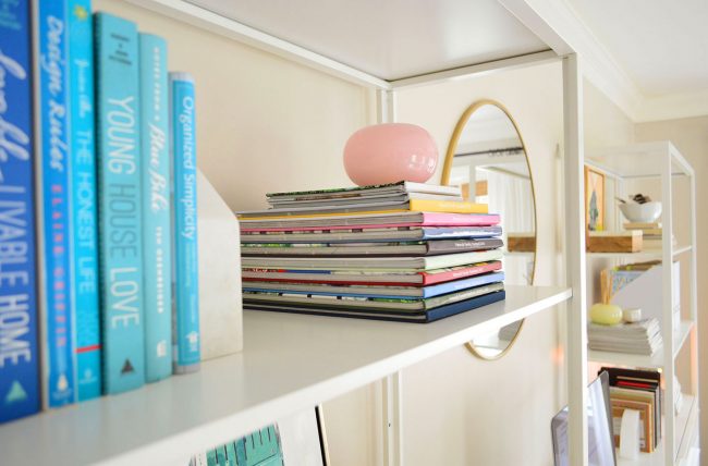
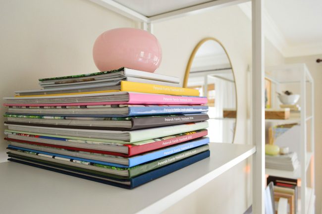
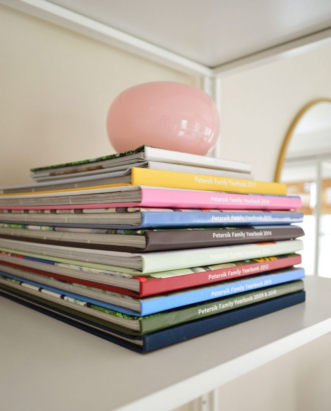
For starters, the spine of their Standard Landscape Photo Book measures just 1/2″ shorter than the old standard size from MyPublisher we used to order, meaning it stacks really naturally on top of our existing collection (it’s the one with the yellow spine below). It’s about an inch and a half less wide too, but you can’t usually tell that when they’re stored flat like this (or leaned vertically now that I think about it) since that’s in the back anyway. I know this seems like a weird thing to obsess over, but part of the fun of making these books has been watching the stack grow. So we’re glad to have found something that allows us to keep building on the same pile.
Price
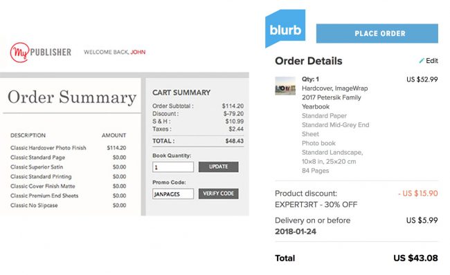
By some miracle, the final price of my Blurb book ended up being within 35 CENTS (as in a quarter and a dime!) of what I spent for our MyPublisher album the previous two years (both clocking in at about $43). A lot of our cost for MyPublisher was paying for extra pages (we always used their max of 99 pages, which one year could’ve cost me nearly $130, so I always waited to order our album until their “Free Extra Pages” promotion came around, saving me about $80). Blurb’s discount codes didn’t seem to be quite as generous (I got one by email that saved me 30%) but their base pricing was much cheaper. Without discounts, I would have spent LESS THAN HALF of what MyPublisher would’ve charged (around $60 versus $130). Although I did keep this year’s book at only 84 pages, so it’s not a total apples-to-apples comparison.
Layout & Software
Like MyPublisher, Blurb allows you to download free software to lay out your book offline. Theirs is called BookWright and it had fewer bells and whistles, but also performed much faster (it used to take me FOREVER to upload all of my pictures into the MyPublisher software). It was pretty slim on preset photo layouts, but you can save your own custom templates easily to solve that. It also wasn’t quite as easy to swap photos around and I didn’t discover until AFTER I ordered our book that you can turn on the “trim area” guides (the purple border below pops up to help you prevent any text or faces from getting trimmed off). So some of my pages ended up being a little more closely cropped than I would’ve liked, but now that I know how to activate that feature it won’t happen again.

Quality
Again, I’m no printing aficionado, but I found no discernable difference between Blurb and MyPublisher’s final product. In fact, I like how Blurb’s spine was a little sharper than MyPublisher’s – although maybe that’s the difference of it being 15 pages shorter.
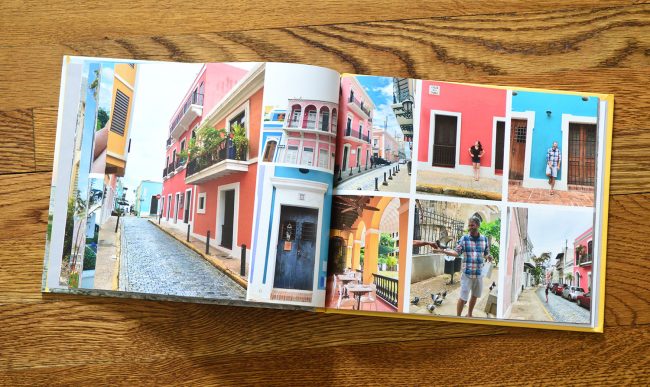
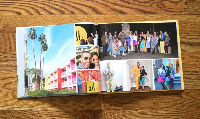
The photo-wrapped cover and the insides all met my standards for color and crispness, despite BookWright warning me that many of the iPhone photos included were too low resolution. A true photographer or graphic designer studying it with a magnifying lens might be more particular about how their images were reproduced, but to my (somewhat picky) naked eye, which you know has a lot of opinions about undertones and lighting, they definitely look great. No complaints about a single photo – and the book contains over 400!
I’m probably forgetting something, but I feel like I’ve blabbed on enough about this random topic. Again, I’m still surprised by how many people cared, so I wanted to give you guys a full report. I think the most important thing is that we’re really grateful that we can carry on our “Family Yearbook” tradition since they’ve each become so important to us. The kids are frequently asking to pull them down and look through them, and it’s always an exciting day when the new book arrives and we can “read” it together for the first time.
Thanks again to everyone who recommended Blurb to us! Happy Yearbooking!
P.S. To anyone wondering why we prefer this system over photo albums, here’s a post all about how much space & money they can save you.
*This post contains affiliate links*
The post Our New Source For Making Family Photo Books appeared first on Young House Love.
Our New Source For Making Family Photo Books published first on www.younghouselove.com
No comments:
Post a Comment