With most of our functional building projects done at the beach house done – like the walk in pantry and the freshly constructed bunk beds (remember when we almost had to tear those down right after we built them?) – we’re starting to turn our attention to some of the big aesthetic projects that are still on our list. This means you kitchen backsplash!

sconces / hood / stools / hardware / shelves / pendant lights / faucet
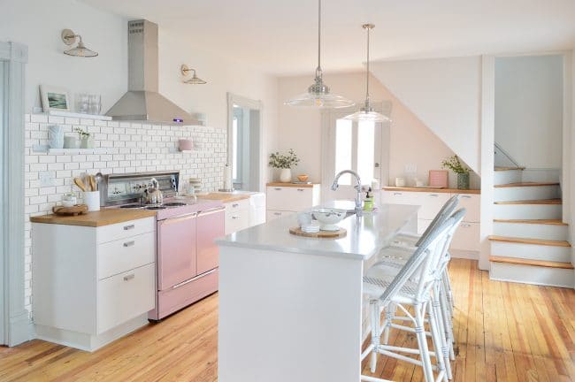
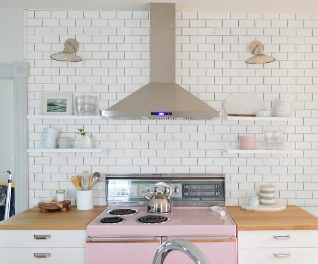
That photo above is a few weeks old (before we swapped out the mini fridge for more counter space) but it’s an important picture because it’s what Sherry and I have been using to imagine what the room’s future backsplash should look like. For reference, the far end of the kitchen is looking a bit more like this now (although even this is outdated because we added the cabinet hardware last week, but ran out of time to take an updated photo).
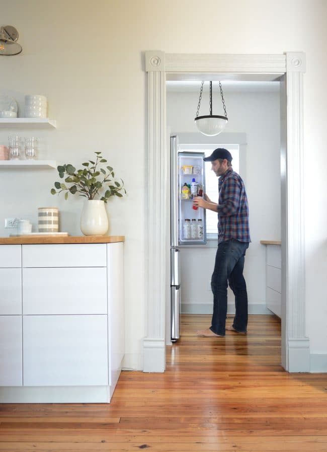
counters / cabinets / fridge / shelves
But anyway, back to the task at hand: planning the backsplash. We’ve been pretty settled on a simple subway tile backsplash for a while now (you may remember seeing it mocked up like this all the way back in September).
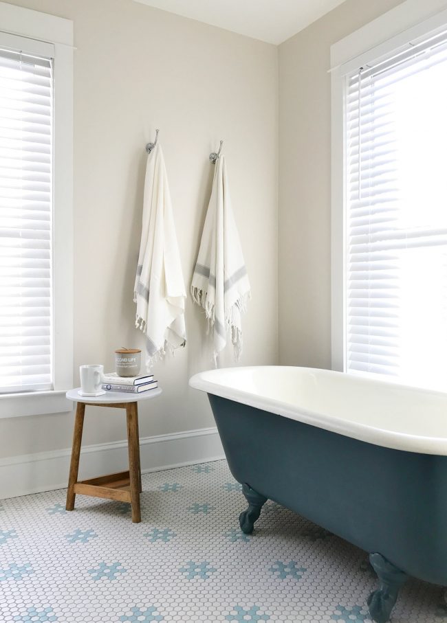
Anything too trendy or too bold felt out of place in this old home, so we fought the little voice telling us to try something “exciting” or “new and different” and stuck with our gut. Call it expected. Call it boring. Call it Missy “Misdemeanor” Elliott. We just couldn’t deny that it felt like the classic, casual, and unfussy kitchen we were aiming for. You know, one that works in an 100 year-old house, like one of those cool old restaurants downtown (the same ones that might have a mosaic tile bathroom like the one we laid upstairs).
marble table / window blinds / white tile / blue tile / similar towels
So really the only conundrum became WHERE do we put the subway tile? Do we do just a standard 18″ backsplash above the counter? Do we go all the way to the ceiling? Do we wrap it around the entire room?? Does it go into the pantry??? Where does the madness stop!?!
Anyone who has followed our past kitchen remodels knows that we’re big fans of tile that goes to the ceiling. We did that in our last house and in our current kitchen:
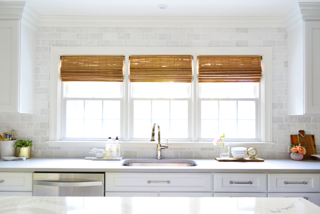
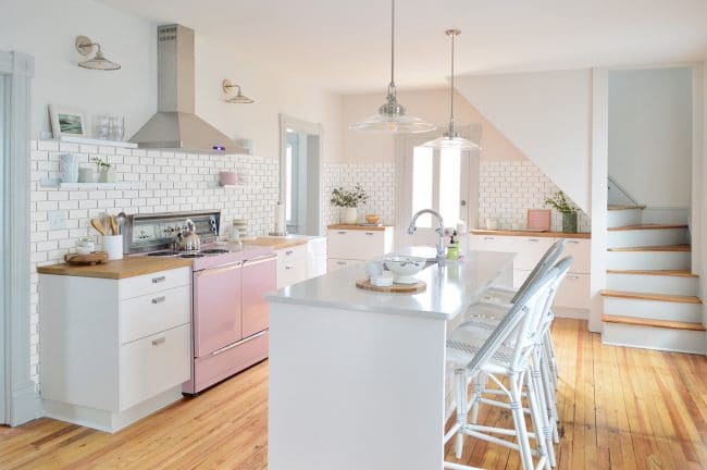
faucet / woven blinds / hardware / similar tile
We also made a last minute decision to continue the tile around the door to the garage (floor to ceiling) because it visually connected all of the cabinetry better and made more of a statement.
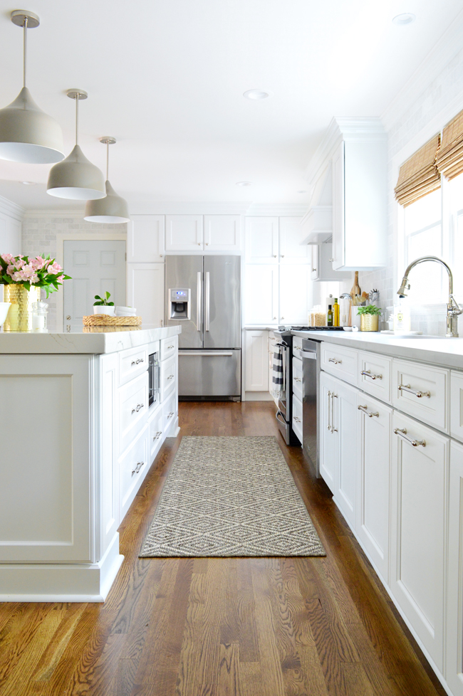
I say all of this just to remind you that we typically err on the side of ALL THE TILE versus some small strip of it somewhere – even if it takes us days to complete said tile (and while we’re doing it we find ourselves seriously questioning our sanity).
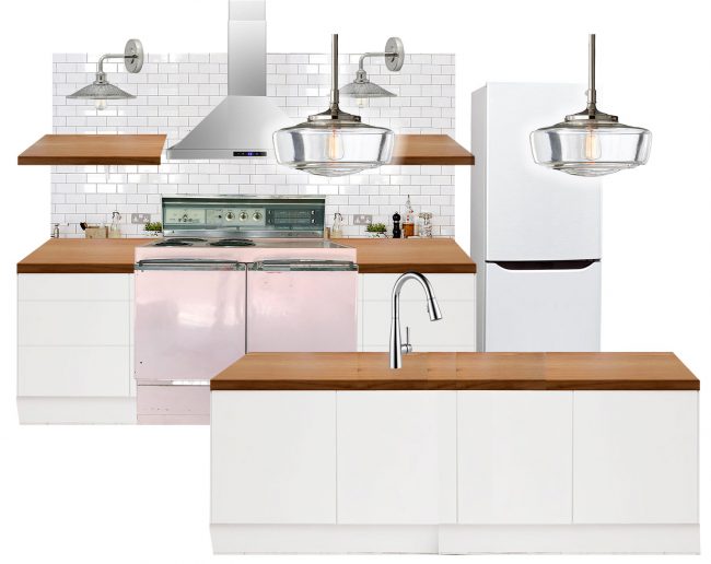
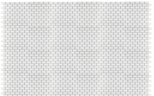
But we do like to plan it out beforehand, just to be sure we’ll like it after putting in all of those hours. Fortunately, our good friend Photoshop “Misdemeanor” Elliott has come to the rescue. I just found a white subway tile pattern on Google and repeated it a few times to create an image that I could layer over that photo of the beach house kitchen (using the Perspective and Skew transform functions to match the angle of the walls). We’re not sure how dark we’ll go with the grout (definitely not black, but probably a medium gray) so this was close enough:
So without further ado, I present to you, several of the options we considered and the (surprising – even to us!) decision we landed on.
Option 1: No Backsplash
Okay, this wasn’t really a seriously considered option, but I included it because we did make the decision to forgo a backsplash in our first kitchen remodel and we’ve regretted it ever since. It would’ve been such an easy way to bring some polish to that kitchen, but we were still early in our DIY days and I think we were intimidated (and a little strapped for budget too). But now we know it’s not hard or even that expensive to pull off (here’s a tutorial for how we added a backsplash in my aunt’s house for under $200!) so we’re excited to install one here – especially after seeing it come to life in photoshop. So… onward!
Option 2: Up To The Hood
Let’s start with the smallest option. Since we don’t have upper cabinets, finding a natural stopping point for the backsplash was our main challenge. We knew a standard 18″ backsplash would probably look too low in such a lofty room (the ceilings are 9′ downstairs at the beach house) and we also thought it might look even more awkward with the extra-tall back panel of our range sitting in front of it (it’s around 10″ above the counter).
We also briefly considered just going to the bottom of those lower shelves, but we thought that too might seem like an awkward room proportion (almost exactly halfway up the wall), so we landed on the idea to tile up to the bottom of the hood/top shelf, which we mocked up above. We were charmed by its simplicity, but it felt a little incomplete and we weren’t crazy about the top shelves not having tile behind them. Have we mentioned we like a whole lotta tile?!
Option 3: Up To The Hood + Back Wall
One alteration that immediately felt better to us was extending the tile along the back wall. It would really emphasize that those shallow storage cabinets are part of the kitchen, even if they’re not connected to the main cooking space. We don’t really anticipate any major prep or water-splashing taking place back there (the counters are only 17″ deep) so we don’t functionally need a backsplash there, but visually we think it’s a big improvement that adds balance to the room.
Option 4: To The Ceiling
Next we skipped ahead to the idea that we thought would end up being the winner: going all the way to the ceiling. Again, we’ve done it in our last two kitchens and we’ve always liked the visual impact. And since this would be our first kitchen renovation with nine foot ceilings, the prospect of going all the way up was extra exciting (come to think of it, maybe we’re addicted to tile? Do we need a support group?). But we did want to try one other thing, just to be sure this option was our favorite…
Option 5: To The Ceiling + Stairway Triangle
For a hot second we wondered: should we go even bigger and tile the bottom of the back staircase too? Part of us thought it was kinda baller (yes, I said it) to wrap that bump-out in tile, and we thought it might help to downplay the big triangle slicing through the back wall. But we realized it would be tough to actually pull off (getting the angles to all lineup, tiling on a slanted surface, etc) and the more we stared at it, it began to look like overkill. Looking at the rendering above helped us realize that tiling “the nook” behind the staircase bump-out seems more natural than covering the bump-out itself. Thanks Photoshop!
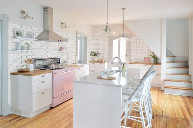
So at this point, our favorite option was #4 – going to the ceiling, but not doing that big triangle. This one, if you don’t feel like scrolling back up a few pics:
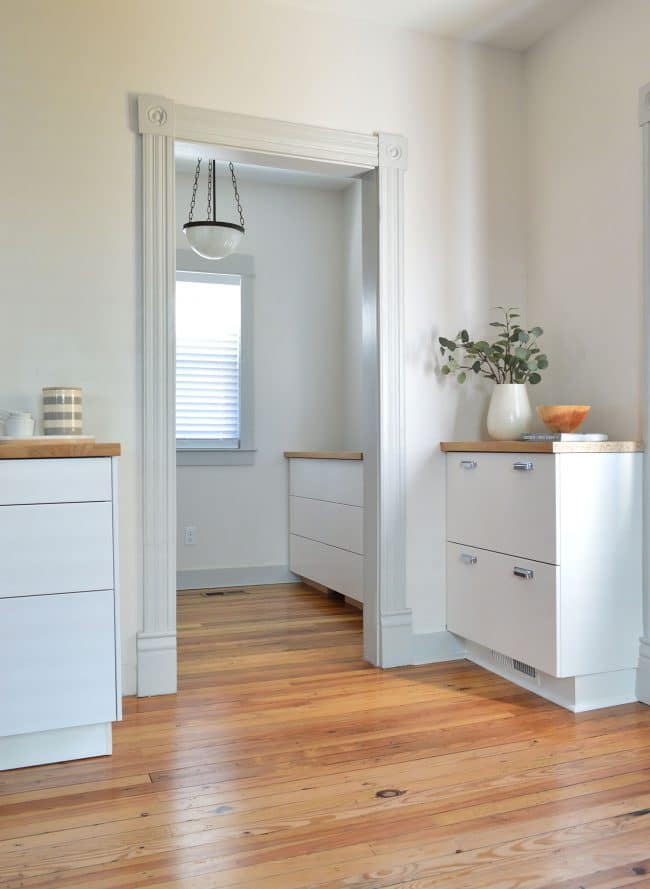
Except we were still bothered by one thing that wasn’t really apparent in our mock-ups, but we knew could be especially weird in real life: the tile’s stopping point on that left-hand wall. Since the kitchen and the dining room share one big open room, if I had stepped back more to take the photo above, you’d see that there’s a lot more wall (over 12 feet!) to the left of that doorway. Can you picture how that vertical bullnose I rendered at the top of the doorway below would look weird if the whole left side of the room was just left untiled?
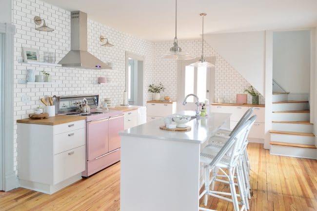
hood / sconces / shelves / counters / hardware / cabinets
Just picture this gleaming white floor-to-ceiling tile arbitrarily stopping two thirds of the way down the wall. No bueno. We thought it would be really weird in person to have a wall that’s partially tiled, without any break or bend or natural stopping point for the tile to terminate.
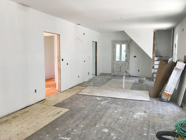
Although we love floor to ceiling tile, we like it when it feels like it’s installed within a nook or space with clear-cut boundaries (like wall corners or floor to ceiling cabinets, which were our stopping points in both our last house and our current kitchen). We realized we don’t have any recent photos of that angle because the dining room walls are still empty and we apparently have avoided photographing it (I’ll try to get one when we’re there this weekend). This is the best one I could dig up, which was right after drywall went up:
We briefly discussed continuing the tile along that entire left wall to the end, but realized that it would not only read as a ton of tile (floor to ceiling without any cabinets under it to break it up!), it just isn’t a good choice for us because we want the kitchen to feel defined from the dining space thanks to the tile. In a big open floor plan with a dining space + a living space, it’s nice to have visual cues that define each area – like a backsplash in the kitchen zone and a big rug under the dining table, for example.
Since we couldn’t get behind our usual tile-to-the-ceiling method in this space, and the first couple of options felt a bit incomplete, we mocked up one last option just for shots and goggles. We actually assumed we’d both hate it, but at least we’d eliminate one more idea…
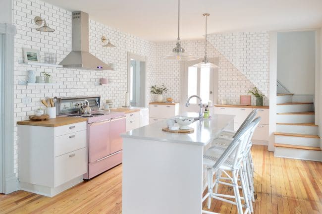
Option 6: To The Doorways
sconces / hood / stools / hardware / shelves / pendant lights / faucet
Miracle of all miracles, stopping the tile between the upper part of the doorways in our little Photoshop rendering actually looked a lot less awkward than we expected – in fact, we instantly warmed up to it because it basically gives us the best of both worlds. It’s more substantial than stopping under the hood (and brings the tile up behind those top shelves like we wanted!) but it gets the advantage of using the doorways as natural stopping points (which means the tile gets to terminate into an edge like we wanted – and it will help to define the kitchen space from the dining space!).
The precise height is still TBD since we’ll probably want a full tile at the top and my mock-up isn’t necessarily to scale, but we were both surprised by how much we liked this solution. It feels like it suits the space and the house really well – classic, casual, and not too try-hard… even if we did have to try hard to come to this conclusion.
Now I know many of you probably landed on other favorites as you saw them – and I do think all of them have their pros and cons. So I thought it would be fun to round out this post with a GIF of them all in one spot:

Our last challenge (besides actually doing the tiling) is picking the exact white subway tile we want to use. We leaning towards just the basic 3 x 6″ subway you can get at Lowe’s or Home Depot (that’s what we used in our first home’s shower and really loved it) but we’re sticklers for white undertones so we have to get a few samples to make sure we land on the one that looks best with our cabinets. Suggestions for your favorite subway tile are welcome!
P.S. For everything from beach house paint colors to where we got furniture & accessories, we created this page to help you find all of that info. We also have one for our house.
*This post contains affiliate links*
The post Brainstorming The Beach House Backsplash appeared first on Young House Love.
Brainstorming The Beach House Backsplash published first on www.younghouselove.com
No comments:
Post a Comment