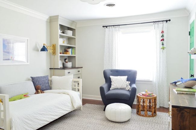
Our little man’s room is looking a little different these days, thanks to finally being done with the crib (our kids love a crib) and making a few other tweaks to the space while we were at it. He’ll be four this April, and he finally decided he was done with the crib earlier in January, which was bittersweet. We’ve had the same crib in our house for nearly 8 years (!!!) since our daughter used it before him for quite a while too. But it was also exciting because it meant his room was about to get some updates after basically being frozen in time for the past four years (you can read all about the process of creating his nursery here).
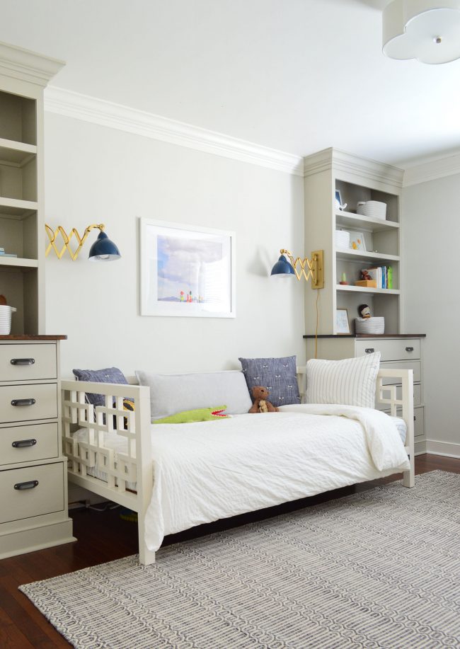
ceiling light / sconces / similar daybed / similar rug / blue bee pillows / art / duvet / sheets
I’m not even exaggerating when I say it hadn’t changed since we put this room together in anticipation of his arrival (back in April of 2014). Same chair, same rug, same curtains, same crib sheets, same green closet door, same bike art, same play baskets, same stuff on the built-ins. Pretty much everything: THE SAME. In fact, whenever anyone asked for an update on his room we said “If you look at the reveal on the blog that’s pretty much what it looks like right now! The only change is that we removed the changing pad after he stopped needing that. But literally almost identical!”
A few months ago he did finally discover that the little “T” wall decals we added were peel-off-able… after more than 3 years of not touching them at all. Oh well, they had a good run. And now that we added some sconces and a large piece of art to that wall between the built-ins, it’s feeling airy and light without them, so it’s all good.
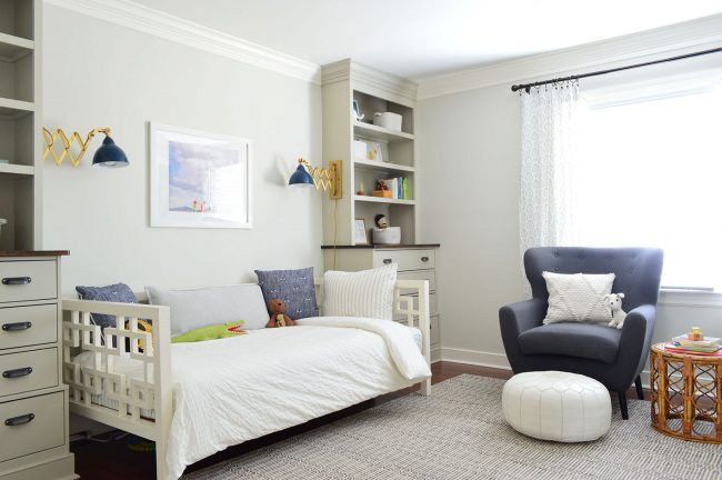
similar chair / pouf / similar side table / curtain rod / similar curtains / similar daybed / sconces
I shot a quick video of the room for you too, so if you wanna see the room “in action” (and get a peek in the closet, etc) – just click play below. NOTE: If you’re reading in a reader, you may need to click through to our blog to see the video. You can also watch it here on YouTube.
You might remember the daybed as the same one we used after our daughter was done with the crib when she was around 3.5 years old. She remained in the daybed until last year, when we upgraded her to a larger full-sized bed (more on that here). That conveniently freed up the daybed to be used by her brother… whenever he ended up being done with his crib (we didn’t know we still had almost a year to go! Ha!). Have I mentioned our kids LOVE A CRIB?!
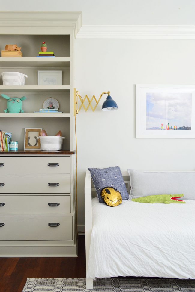
similar drawer hardware / sconce / art / bee pillow / duvet / cloth bin
A daybed is a great way to transition out of a crib since it’s low to the ground, has two rails on the ends, and is basically just sort of like a big crib without the front. This one is from West Elm (no longer sold, but here’s something similar) and it fits a regular twin-sized mattress. We actually designed these built-ins to eventually accommodate a twin or even a full sized bed, so it’s like the space is finally fulfilling its bed destiny.
To read how we DIYed the built-ins in each corner of the room, here’s a full write up. We just used ready-made Ikea dressers and added the bookcase on top, using crown molding and baseboard to make them look built-in. This is a really doable project, even for a beginner.
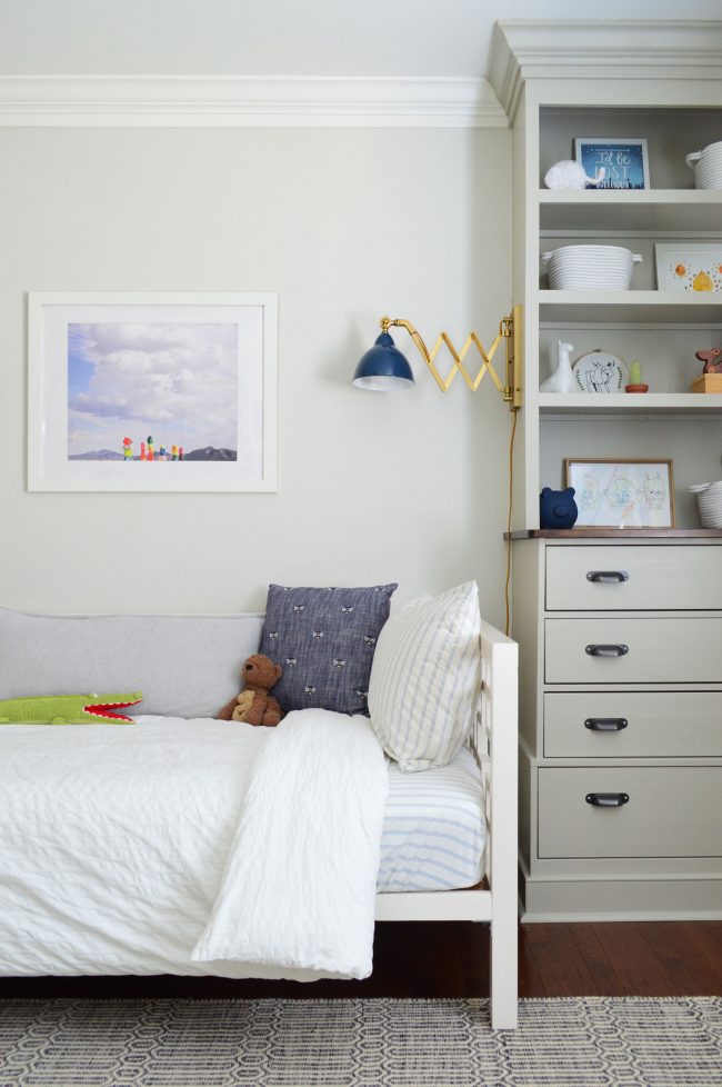
art / bee pillow / duvet / sconce / cloth bin / similar drawer hardware / “I’d Be Lost” print
The sconces might be my favorite part because I always dreamed of adding sconces to either side of the “interior nook” that the built-ins created. It didn’t make sense to shine lights down on a baby in a crib (just picture that – a little “baby investigation” – ha!) so I showed unusual restraint and waited until we changed the crib out for a bed to add them. Then one day I discovered that Target sold these awesome brass and blue enamel sconces for just $49.99 (you have the best luck finding two of them by ordering them online). They basically screamed “BUY ME” and I listened.
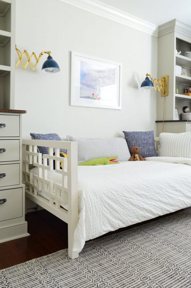
The best thing about them is that they’re plug-in sconces (couldn’t hardwire anything into the side of the built-ins anyway) and the on/off switch is right on the base of the sconce, so you don’t have to hunt for it on the cord somewhere behind the bed, which is blissfully convenient.
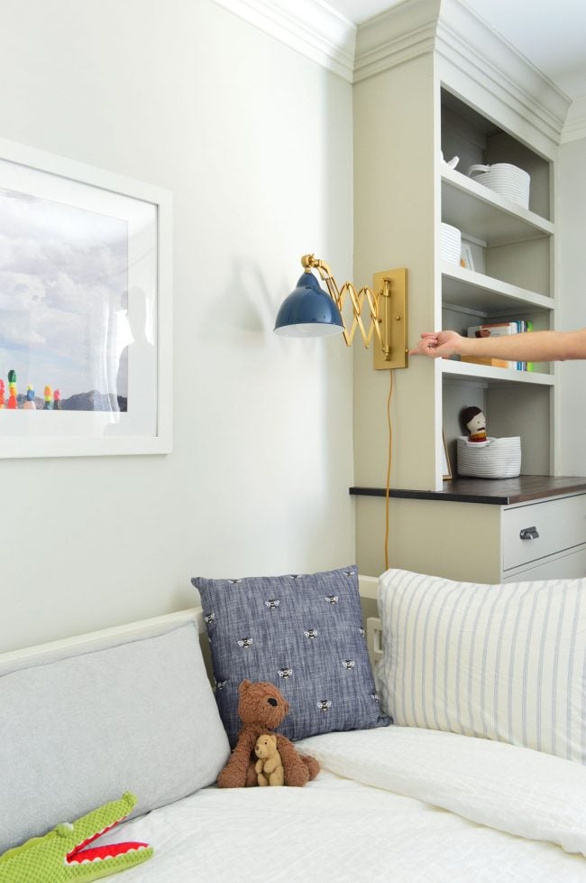
We also bought some 3M Command cord clips to secure the cords against the baseboard so they’re not flapping around anywhere and we’re happy to report that we haven’t had any issues with anyone messing with them (younger kids in a crib might yank on them, so I’d reserve them for an older kid in a bed). It’s a nice clean look to have them turn and follow the baseboard too, so the cord clips have been really helpful.

The art is another favorite find for the room, especially since the combo of rocks (what almost-four-year-old doesn’t love rocks?!) and bright colors is basically our son’s sweet spot these days. It’s a downloadable print from Jenny’s Print Shop that was just $15 for the download and we got an 18 x 24″ print of it at FedEx Office for $22. If you guys haven’t check out Jenny’s Print Shop yet, I highly recommend it. You can get such affordable large scale prints this way (or really prints of any size). We already had this frame, so all together it was under $37 for some awesome wall-filling art!
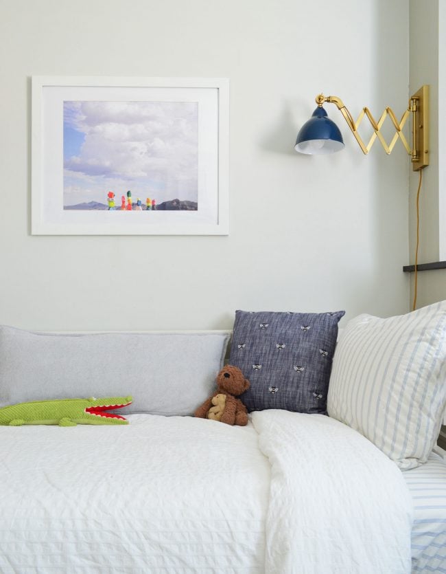
To cozy up his new bed, we added some blue & white pinstripe sheets, a couple of these bee pillows, and this long gray bolster (which has a zip off cover). The duvet is the same Ikea one we also use in our bedroom. That’s a new pillow on the chair too (it’s this one) just to bring some more of the light colors from the bed over to that side of the room. The side table is a secondhand find (here’s something similar), the rug was a HomeGoods discovery (here’s something similar), the pouf is from here, and the chair is no longer sold (but here’s something similar).
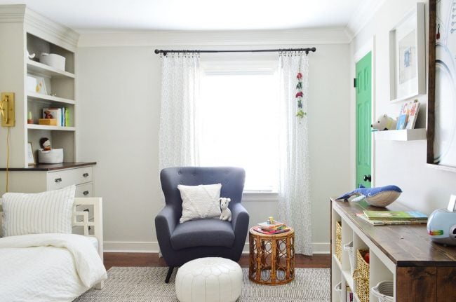
Although the room has moved away from a lot of the forest greens we originally decorated with, he still loves his cheerful closet door (it’s Irish Moss by Benjamin Moore), which ties into the giant bike print that still hangs over his bookcase (that was a print that hung in The Gap and we asked if we could have it when they changed our their displays).
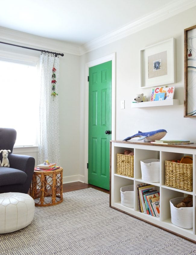
similar rug / similar chair / pillow / pouf / similar side table / woven baskets / fabric bins / similar curtains
His “changing table” (really just an Ikea bookcase that we wrapped in wood) has officially changed back to being a bookcase. The natural woven baskets in the cubbies were there before, but I did swap some light colored fabric bins in (to replace two larger and more baby-ish bins we used to have with a gorilla and a dragon on them). Since we’re not storing bulky diapers or baby blankets, the smaller baskets have been easier for a three-year-old to pull in and out to help clean up his own toys, which is always a plus.
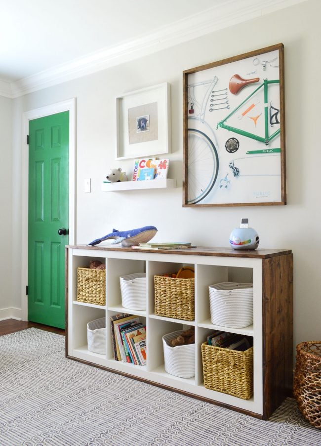
Whenever I share a picture of this whale everyone asks where it’s from. We got it at Pottery Barn Kids many years ago. Maybe in 2012? Wish they’d bring it back, it’s so cute. And that shelf with the books in it…. remember when John built that eight years ago?! It was the very first thing he ever built. And now the man can make built-ins and even decks! Well, deck. He might only make one of those in his lifetime. Ha!
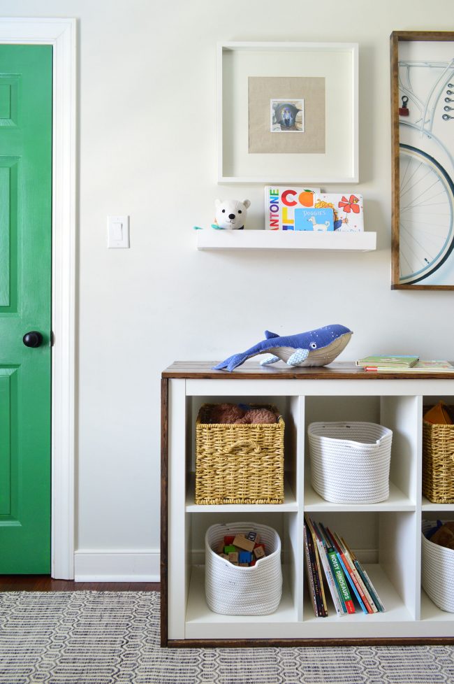
That round thing with the iPod in it is a sound machine we’ve had forever that we use to play an album of white noise on repeat while he sleeps (our daughter used to use this one). I joke that we might be the last household in the world who uses an iPod everyday, but if it works, it works.
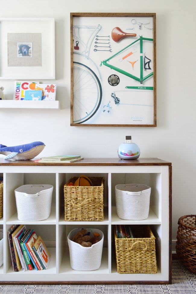
Oh and a few people asked why we didn’t go right for a full sized bed in here since we mentioned how our daughter’s room felt so much more grounded and less like it had a big skating rink in the middle of it when we traded a full bed in for the daybed, but this room is a lot smaller – maybe even half the size. So it would feel much more cramped with a bigger bed, and he still uses the floor a lot for spreading out cars and blocks, so the daybed is great for this room.
And it’s always fun to look back at what we started with. This is the room, complete with old carpeting and pink trim back when we bought this house in 2012! Note: you can see all of the before & afters from this house right here on our House Tour page.
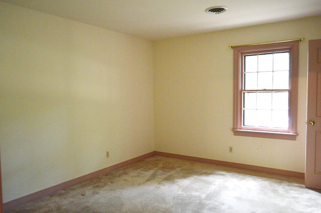
It wasn’t the worst room to start with, but it sure has come a long way. Even if it ends up getting frozen in time for a few more years…

And for anyone who’d like to “get the look” I made this little mood board full of actual things we own/bought for the room (and some similar items if the original ones are no longer for sale):
1 / 2 / 3 / 4 / 5 / 6 / 7 / 8 / 9 / 10 / 11 / 12 / 13 / 14 / 15 / 16 /17 / 18 / 19 / 20

P.S. You can see how this room together as a nursery here, learn how we built the built-ins here, and see how we wrapped that Ikea bookcase in wood here. Also, for sources and paint colors throughout our entire house, we created this Shop Our House page for you guys with all of those details.
*This post contains affiliate links*
The post Houston, We Have A Big Boy Bedroom (Buh-Bye Crib!) appeared first on Young House Love.
Houston, We Have A Big Boy Bedroom (Buh-Bye Crib!) published first on www.younghouselove.com
No comments:
Post a Comment