Tiling was one of the most daunting tasks on our duplex to-do list this year (four bathrooms! two mudrooms! and there are still two backsplashes on the list) so it’s a HUGE relief to say that all of those floors and showers and tub surrounds are officially done (well, like 95% done – more on that later). So today we wanted to show you how they’ve all turned out and share some of the lessons we learned along the way, including which tiles we’d buy again in a heartbeat… and the ones we’d think twice about attempting ever again.
floor tile | wall tile | shower floor | grout: frost | door: SW Oyster Bay
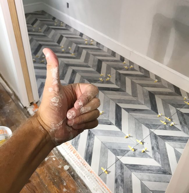
Listeners of last week’s podcast know that after two long weekends spent tiling the duplex, we completed all six of the floors ourselves (two mudrooms and four bathrooms!) but we decided to hire out the four remaining shower surrounds in order to keep things on schedule. What would’ve taken me and Sherry several more weekends to accomplish was knocked out by our contractor’s crew in less than a week – which means we got to spend all that time we saved doing actual work that we get paid for, so it worked out well.
For each of the four shower/tub surrounds we chose white subway tile for the walls (simple, classic, affordable, and it’s a tile that lets the more interesting floor tile in each room be the star). So this post is mostly going to focus on the floors in each space since we’ve covered our adventures in subway tile here and here already.
floor tile | wall tile | shower floor | grout: warm gray | door: SW White Truffle
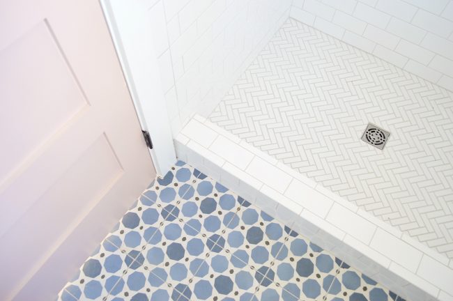
But as for the subway tile we used, we went with this affordable 3 x 6″ subway tile installed in a standard running bond pattern (the same stuff we used and loved on the beach house’s kitchen backsplash). And the two master showers got this white herringbone on the floor, which added a hint of interest to that surface without being too crazy busy.
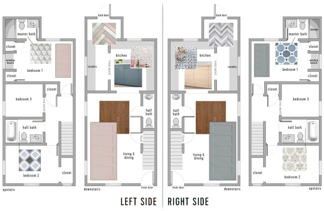
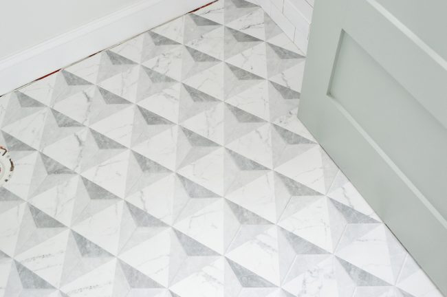
We showed you all of the floor tile selections in this post about how we chose our tile, cabinets, and paint colors. But we did make one last minute change to the plan from that post: we swapped the two master bathroom tile choices (seen in the two photos above) because the marble-esque tile ended up looking better with the blue-green doors than the pink ones. As much planning as you do beforehand, there’s really nothing like seeing the tile in the space next to the items that are in there, hence that last minute swap.
We mentioned in that same post that we limited ourselves to larger tiles with interesting patterns, rather than smaller mosaics because we knew it would help the process go faster (we LOVE our pink house master bathroom floor, but it took us forever and a day). But even within that larger-tile parameter, we learned that some tiles were faster, easier, and more foolproof to lay than others. We LOVE how all of them turned out in the end, but there are some that gave us more difficulty (and took much longer to install) than others. So if speed and ease are an important factor when it comes to picking tile, or if you’re a newbie tiler and want to choose something that’s simple and straightforward… this post should help.
So let’s start with the easiest ones:
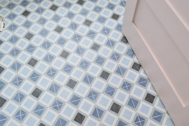
The Square Patterned Tiles
floor tile | grout: warm gray | door: SW White Truffle
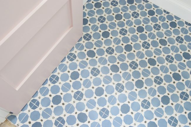
The blue patterned tiles that we laid in the bathrooms on the left side were the fastest and the most straightforward to install. Why? Because (1) they were square and (2) the pattern was symmetrical on all sides, meaning you could put the tile down in any orientation and it would line up. The combination of those two factors made it much easier to lay out, cut, and install because we were always working with right angles (we’ll talk about hex tile in a moment!). And because the pattern was the same on every edge, we had less waste because we could use both sides of a cut tile again in another smaller spot (like around any edge).
floor tile | grout: warm gray | door: SW White Truffle | wall: SW Spare White
The size of these tiles was also really easy to work with. The master bath tile (above) was around an 8 x 8″ square while the hall bath tile (below) was 9 x 9″, so they weren’t heavy or unruly like larger tiles can be, but they filled the space more quickly than a smaller mosaic would have. I think each room took us about two hours to lay, which felt like nothing compared to some of the others.
floor tile |grout: frost | door: SW White Truffle
And even though they were just simple square tiles that went down easily, the final floor still looks interesting and intricate – which was the goal. So we’re thrilled with these. Ten stars. Would recommend. Final verdict: If you’re looking to achieve something similar and keep your project as simple as possible, I would choose square tiles like these and these. They’re both porcelain too, so they don’t need to be sealed and cared for like more finicky materials do (we’re looking at you cement tile).
floor tile | wall tile | grout: frost | door: SW White Truffle | drop-in tub
The only thing we’d do differently next time is we’d use a darker gray grout in the room above. We were trying to streamline everything and keep cost down by not buying different grout colors for each room (and whatever color went on the floors also went in the shower – some of which weren’t grouted at the time of these photos). But Sherry thinks a darker gray would’ve made the grout lines recede a bit more, helping the diamond pattern show through stronger. Anything for a diamond, right?
Let’s move on to the next simplest tile to install…
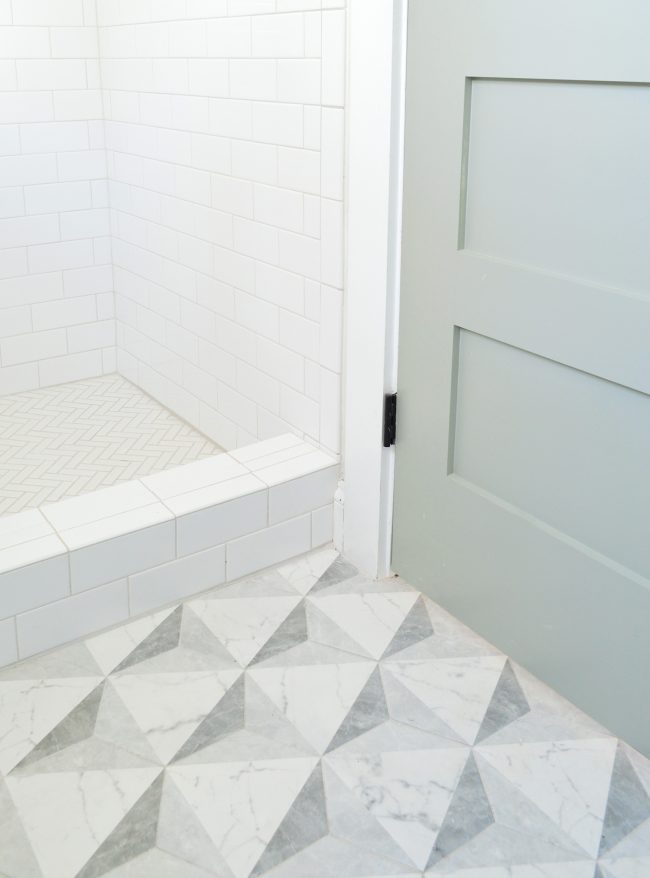
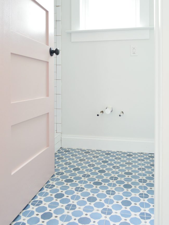
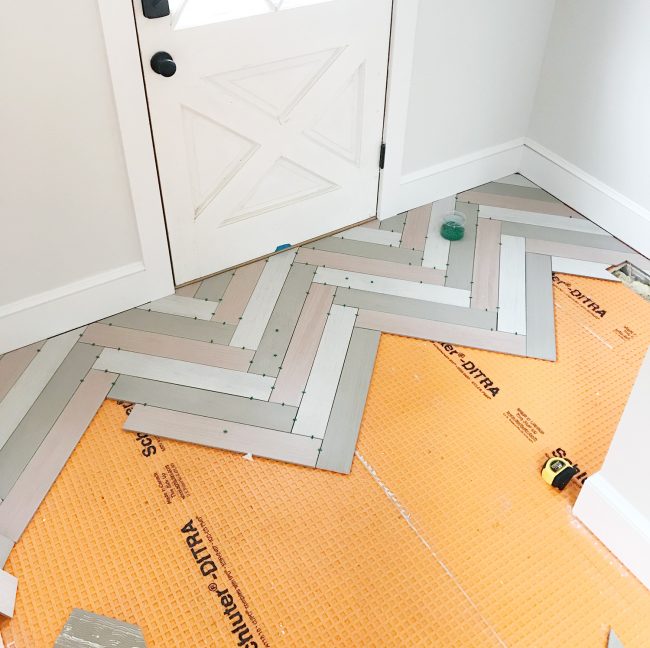
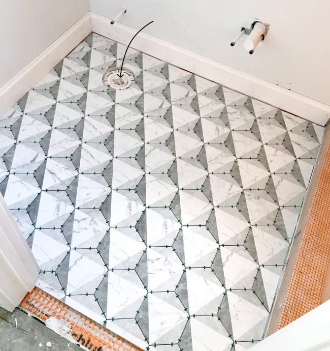
The Marble Hex Tile
floor tile | grout: frost | door: SW Oyster Bay
Now, this tile isn’t actually marble (it’s porcelain, just like everything else – because they’re extra durable and never need to be sealed) but it may be our favorite in the entire house. The marble finish is classic and bright, but the pattern on top makes it unique and unusual. We’ve actually talked about maybe using the same tile in our own bathroom here in Richmond – thats how much we like it.
(Note: the space between the tile & the tub or the tile & the baseboard in various shots throughout this post will get white quarter round molding, so it all looks seamless in the end)
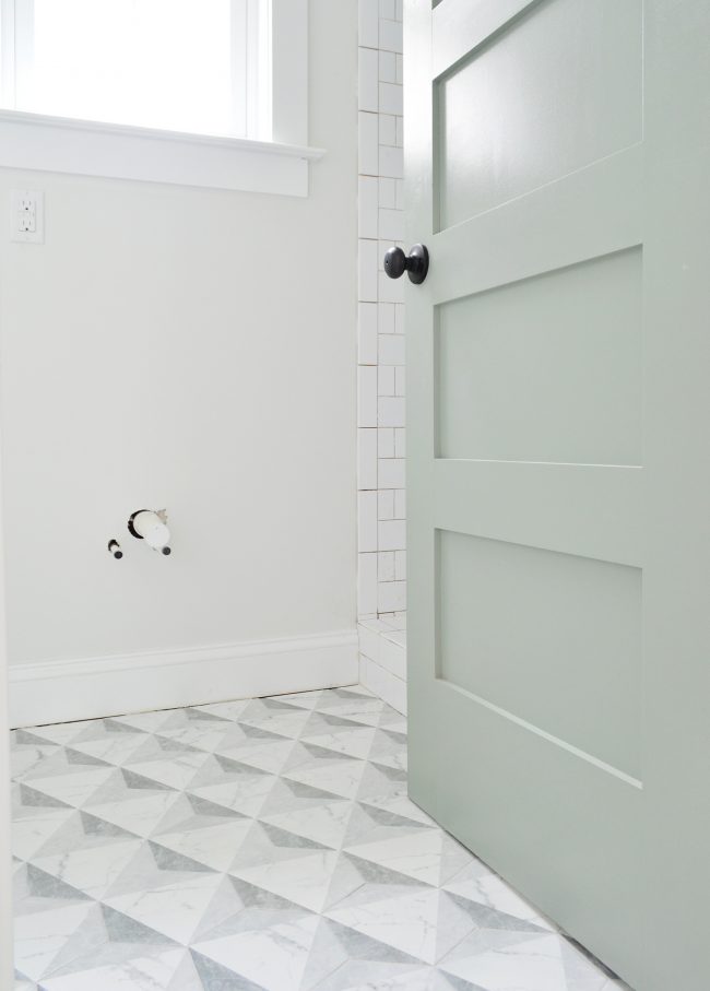
floor tile | wall tile | grout: frost | door: SW Oyster Bay | wall: SW Spare White
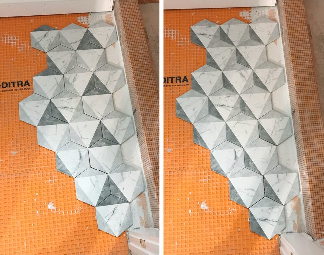
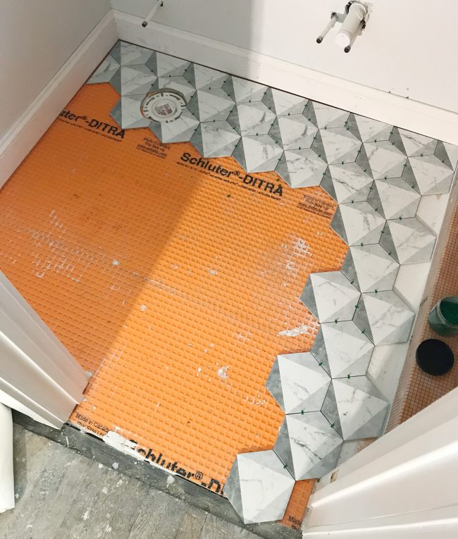
Like the square tiles, this hex was about 8 x 8″ so the size was very manageable to work with and it provided fast coverage in the room. I think this one maybe took us 3-4 hours instead of 2. And that’s mainly because (1) the hex shape took more care to cut and lay and (2) the asymmetrical pattern took more concentration to not screw up. Speaking of which, there are two different looks you can get with this tile. See how the triangles are all the same color in the left picture below and they’re shaded differently in the right picture because we rotated the hexes? We laid out both options and picked the one on the right.
In addition to having to concentrate on not screwing up the pattern, hex tiles are a bit more finicky when it comes to spacing and not letting your layout drift. One tile laid too close to another in your first corner can cause big headaches down the line as that little inconsistency gets magnified in each subsequent row. So we actually laid out lots of tile BEFORE mixing Thinset to check how everything lined up and to ensure that we didn’t end up with slivers of tile anywhere. This may seem like overkill, but it made things go much faster once we actually started setting things for good.
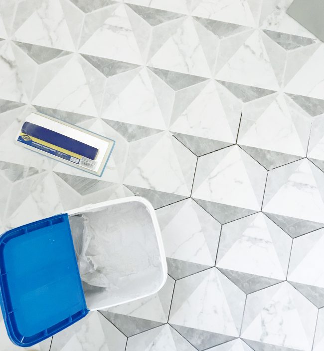
Final Verdict: Ultimately this tile was noticeably (but not dramatically) harder than the square tiles, and with enough spacers (we used 1/16th spacers) we were able to keep everything lined up and spaced similarly. Even if our spacing had drifted a little, the grout color we used disguised the spacing pretty well anyways. Sidenote: we love this Mapei grout because it comes premixed AND doesn’t need to be sealed and is durable/flexible/stain resistant. So once it’s dried and any grout haze is buffed off, it’s totally good to go. Our contractor swears by it and won’t use anything else, so we tried it throughout the pink house and after over a year of heavy use, all the grout in the bathrooms/mudroom still look mint (no grout scrubbing in over a year, folks!)
But just because this hex tile went down smoothly, doesn’t mean it all will…
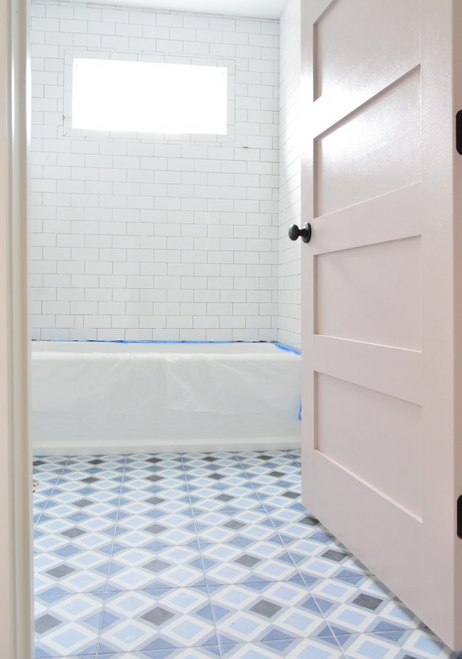
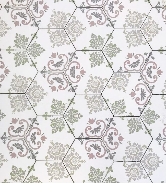
The Patterned Hex Tile
This other hex tile went in hall bathroom on the same side as the one above and, well, it’s a good thing we love how this tile turned out because it felt straight up cursed when we were installing it.
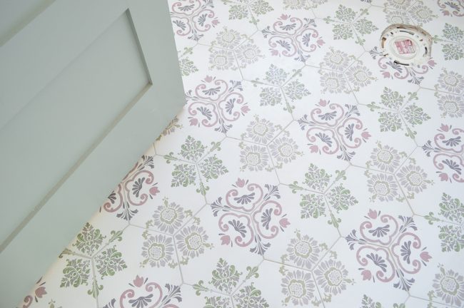
floor tile | grout: warm gray | door: SW Oyster Bay
First, it presented some of the same challenges as the last hex tile – a non-square shape and an asymmetrical pattern. But this pattern was even trickier to keep straight, which caused a few bad cuts along the way (plus, it was much harder to reuse cut pieces because the pattern was so particular). I actually laid one tile in the WRONG direction and we didn’t notice it until a week later when it was time to grout. Can you spot it below?
It wasn’t a big deal to fix. I just broke it up with a hammer, removed the shattered pieces of that single tile, and installed a new piece in its place – but it did set my grouting back a day because we had to wait for that new thinset to cure before grouting. And of course, this happened AFTER we had run out of tile during the actual installation. Yep, we were like 80% done and had to order another box. So this room had two pretty frustrating setbacks. But eventually we got it done.
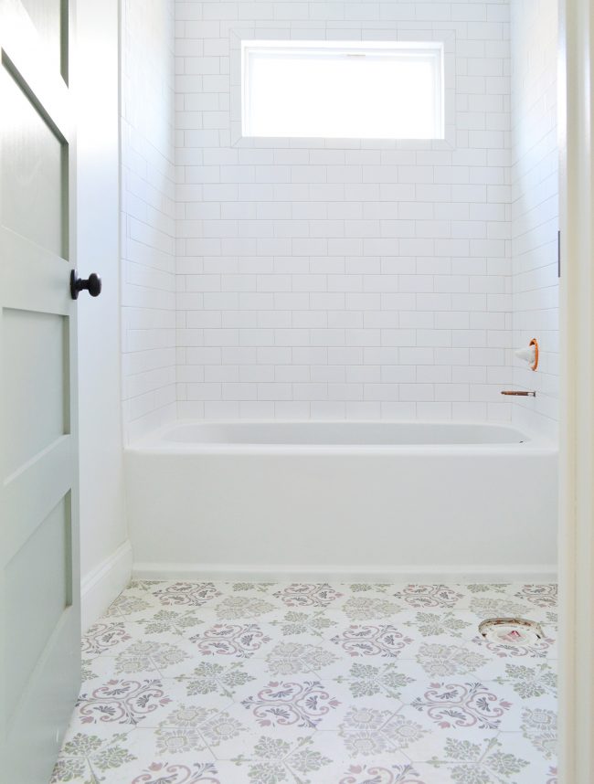
floor tile | grout: warm gray | door: SW Oyster Bay | wall: SW Spare White | drop-in tub
We actually think the square footage calculations on the website are wrong because a couple of our readers reported being short on these same tiles as well. And even without any bad cuts, we don’t think we would have had enough (again: it’s really really hard to reuse your scraps with a pattern like this). So if you use these tiles, I’d recommend getting around 25% extra (not just your typical 10-15% recommended overage).
Final Verdict: If ease and speed are important factors for you when you’re choosing a tile, I would NOT recommend this one. The result was great, but keeping the pattern straight kinda made our brains hurt, this specific tile ran short for us based on the square footage listed on the site (and we heard it did for a few other people), and now we know that we can get interesting patterns with simpler square tiles.
The Chevron Mudroom Tile
Let’s move downstairs to the two mudrooms / laundry rooms. I don’t have “after” photos of these because we haven’t grouted them quite yet (since the back doors act as the main entrances for the crew, the mudrooms are still seeing a lot of foot traffic and grime). So right now they’re both covered in protective paper and we’ll grout once things calm down over there. That means my best photos are mostly progress photos.
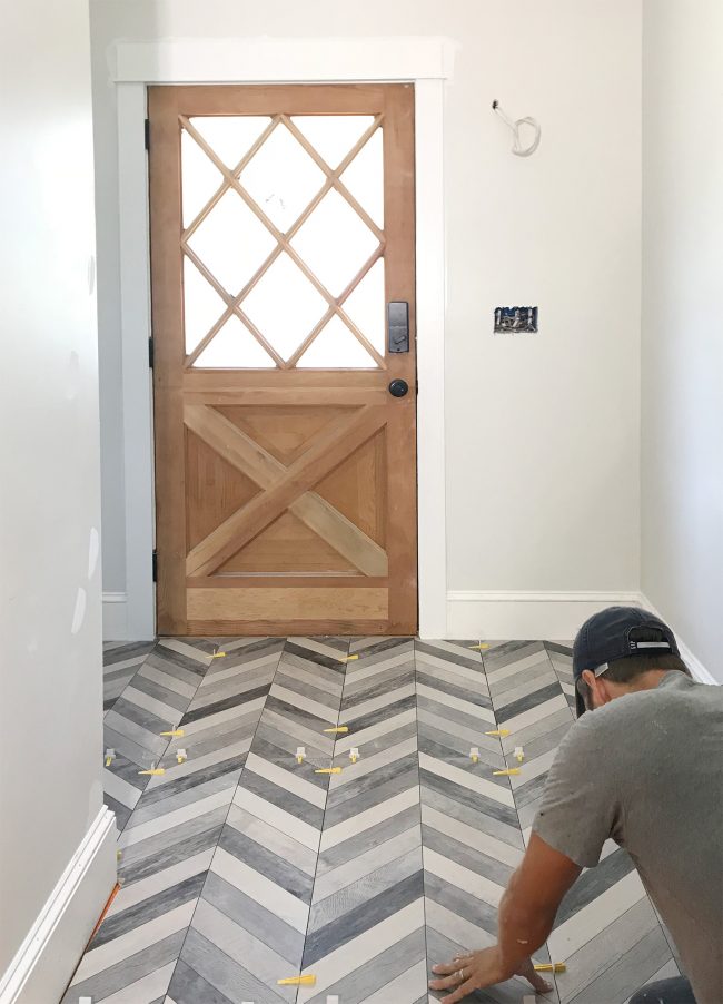
floor tile | spacers |wall: SW Spare White | trim: SW Extra White
We really liked installing this chevron tile because the rectangular shape made it easy to lay out and cut, plus the size (17″ x 35″) meant the room – which is nearly the size of all four bathrooms combined – filled up very quickly. The only downside to the size was that they were a bit heavy and cumbersome to maneuver, and I had to get creative with how I rested them on the guide of my wet saw to get them to fit under the blade while I cut them. Plus, keeping big tiles level can be challenging so we always recommend using these LASH spacers, which you can read more about in this post.
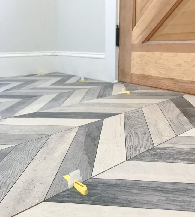
My only beef with this tile is that ideally, your spacing between tiles would match the spacing of the zigzags within the tile itself. However, to do that, the manufacturer recommends a (wait for it) … 2/17th spacer. WHO THE HECK SELLS A TWO-SEVENTEENTHS SPACER?! Fortunately, a standard 1/8th or 1/16th (which is what we did) is pretty close to 2/17ths. But still, I feel like it’s an unnecessary complication that could make your chevron not line up perfectly. But even still, for a big room, I would definitely choose this tile again.
Final Verdict: Larger tiles can be harder to handle, cut, and to get level, but these tiles were worth the trouble and we finished the room quickly since they were so large. It’s also one our favorite tiles looks-wise (this room gets the most in-person compliments) and it’s extremely durable (porcelain again) so we would recommend this for sure, especially with the LASH spacers we used.
The Herringbone Mudroom Tile
I’ve saved the best for last. And by the best, I mean hands-down-the-hardest. Yes folks, this is the one we probably would NOT do again… which is hard to say because it’s so darn cool to look at (even here, when it’s still ungrouted). Reminder: the space between the tile & the baseboard in various shots throughout this post will get white quarter round molding, so it’ll all look seamless in the end.
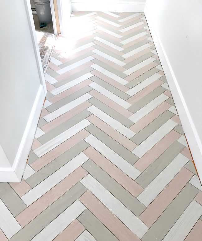
floor tiles: pink, white, and taupe | wall: SW Spare White | trim: SW Extra White
To create this floor we laid three different colors of long porcelain tiles (pink, white, and taupe) in a herringbone pattern, making it a perfect storm of all the challenges of the previous rooms combined:
- The tri-color pattern took lots of concentration to keep straight
- Despite being long rectangular tiles, laying a herringbone meant LOTS of angled cuts, which are less forgiving
- It was difficult to reuse cut pieces because of the alternating colors and angled cuts
- A herringbone pattern needs meticulous spacing to keep your pattern from drifting
Because of all of those factors – and because it was such a large room – this is the only space that took us an entire day to complete. Heck, it took us more than two hours just to get our pattern planned and the initial pieces cut. Maybe we were just tired (this was room five of six that we did across two consecutive weekends) but it took nearly all of our mental energy to precisely measure all of these angled cuts, to keep things square to the walls, and to not screw up the color sequence in the process.
Final Verdict: This was by far the hardest tile choice and it took the longest and required the most mental calculations (angled cuts, creating the pattern ourselves with three different colored tiles, etc). I think it could’ve been simpler had it been a smaller room (or frankly, just a wider room with more full pieces) or if we hadn’t done the herringbone pattern, so I don’t want to totally dissuade anyone from recreating this. Because again, we’re REALLY happy with the result. But I do want you guys to know what you’re getting yourselves into.
And One More Thing… About Toilet Holes
This post didn’t cover a lot of “how to” because tiling is something we’ve talked a lot about over the years (I’ll link to some of our previous tutorials at the bottom of this post). But I did want to cover one thing that lots of people asked about on Instagram: cutting around the toilet flange in the floor. See that nice round cut below? Who knew so many people would notice and ask us how it’s done. So here ya go.
I didn’t document this process and we were already done by the time the process arose, so I’ve tried to illustrate below what I do to make the round cuts around the flange. Most people use an angle grinder to get a really pretty circle cut, but I don’t own one, so my process involves my wet saw and it’s decidedly less pretty, but here it goes…
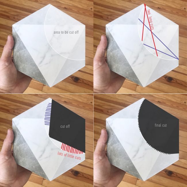
Basically once I’ve marked the area that needs to be cut, I make a two long cuts from each side at the shallowest angles I can manage (marked in red and purple in the top right picture). This removes a few big chunks and makes the next cuts easier.
Then I make a bunch of short cuts very close together – almost like making teeth – along the edge of the circle (marked in purple and red in the bottom left picture above). The “teeth” usually break off in the process, or if they’re too thick I just run my blade against them again. The final result is rarely a perfect circle and often has little indentations where I made the teeth cuts. But it’ll all be covered by a toilet anyways, so it doesn’t need to be perfect.
In fact, I probably don’t need to be as meticulous as I am since it’ll be hidden under the toilet. But you don’t want to get too lazy because your toilet needs a flat solid surface to rest on and if your chosen porcelain throne has an especially small base, a larger cut could end up peeking out.
Speaking of which, the upstairs toilets and vanities got installed last week so we’re hoping to make a trip out there this weekend to check it all out! Things are really coming together!!
More Tiling Projects & How To’s:
If you’re interested in more tutorials on tiling or to check out some of our previous tile projects, check out some of the links below:
*This post contains affiliate links*
The post The Duplex Is Tiled! Here’s What We Loved & What We Wouldn’t Do Again appeared first on Young House Love.
The Duplex Is Tiled! Here’s What We Loved & What We Wouldn’t Do Again published first on
www.younghouselove.com


 )
)


